
What the brand needed
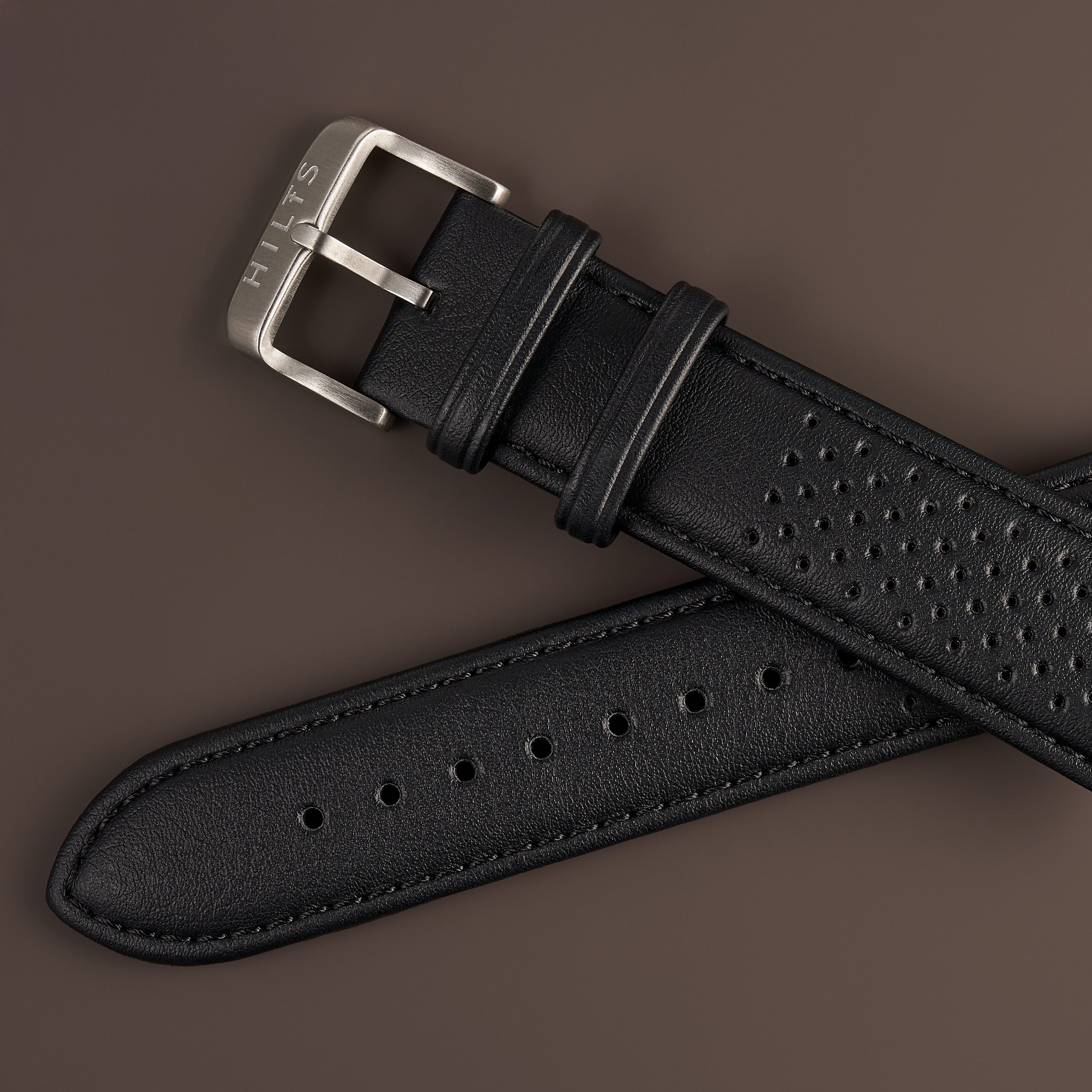
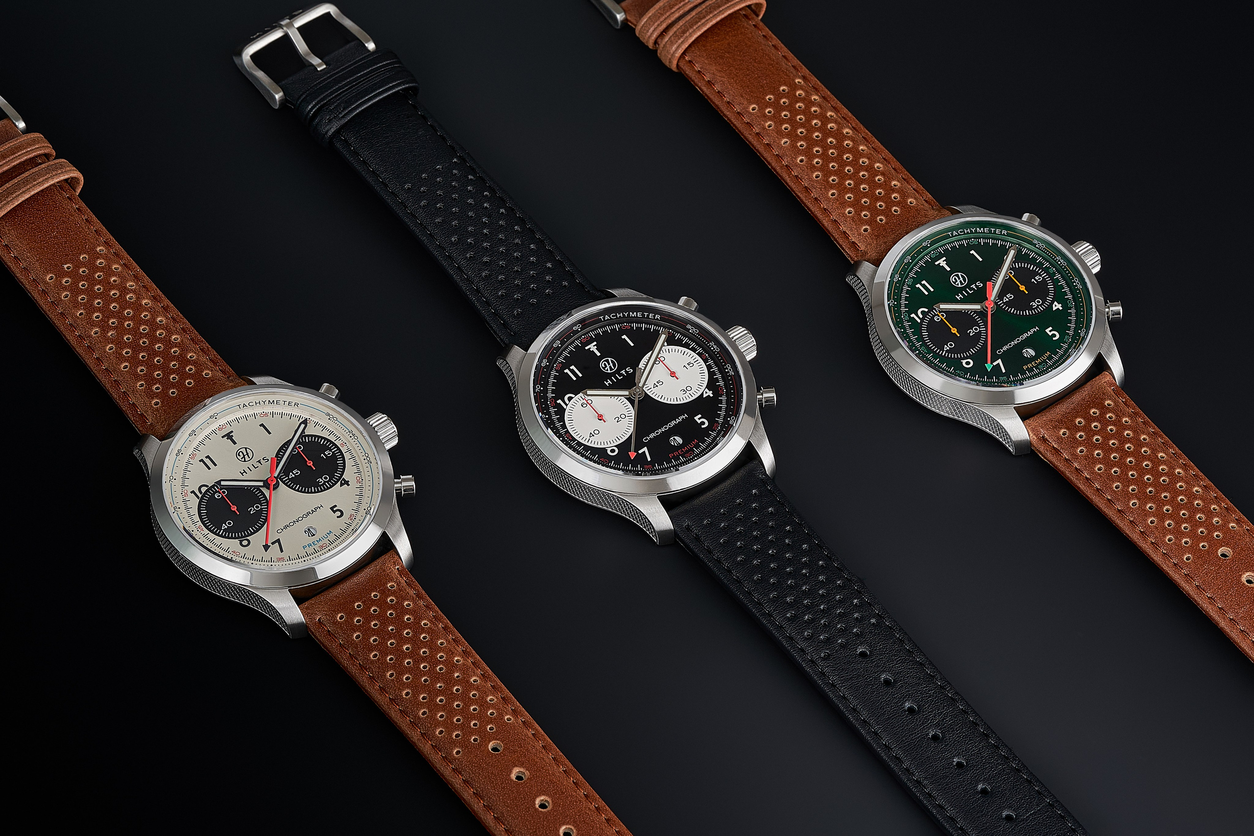
A catalogue that could grow. It began as a series of catalogue frames and expanded across four sessions into wrist photography, video and a line of accessories — every stage sitting in the same grid as the one before it, without anything being matched by eye.
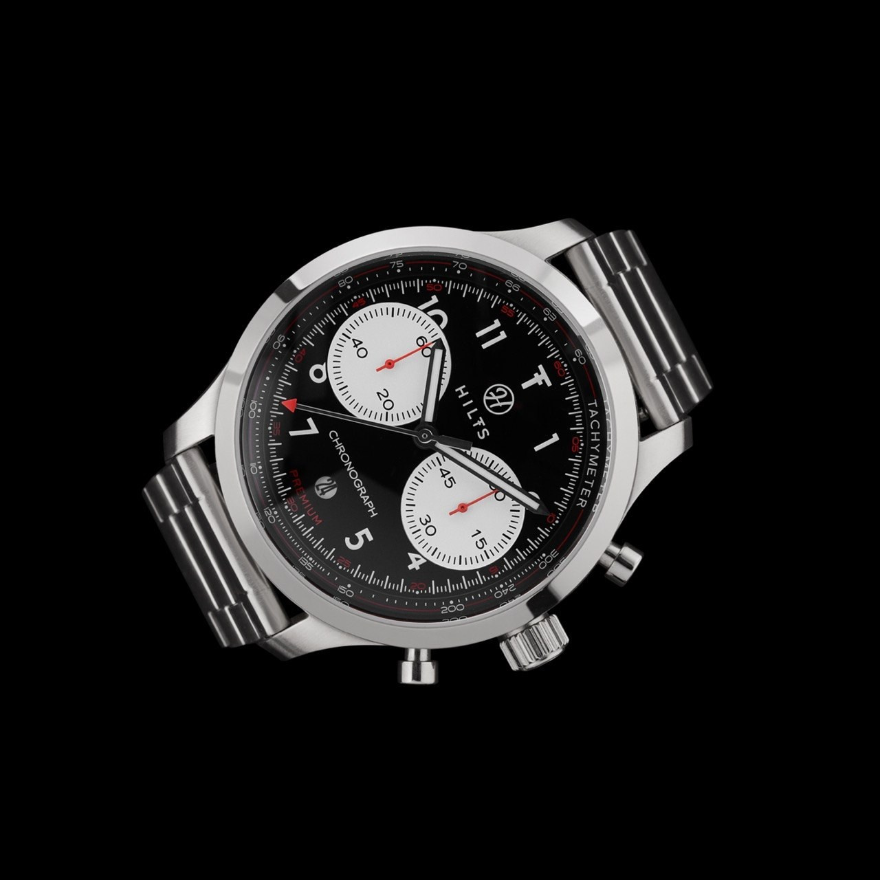
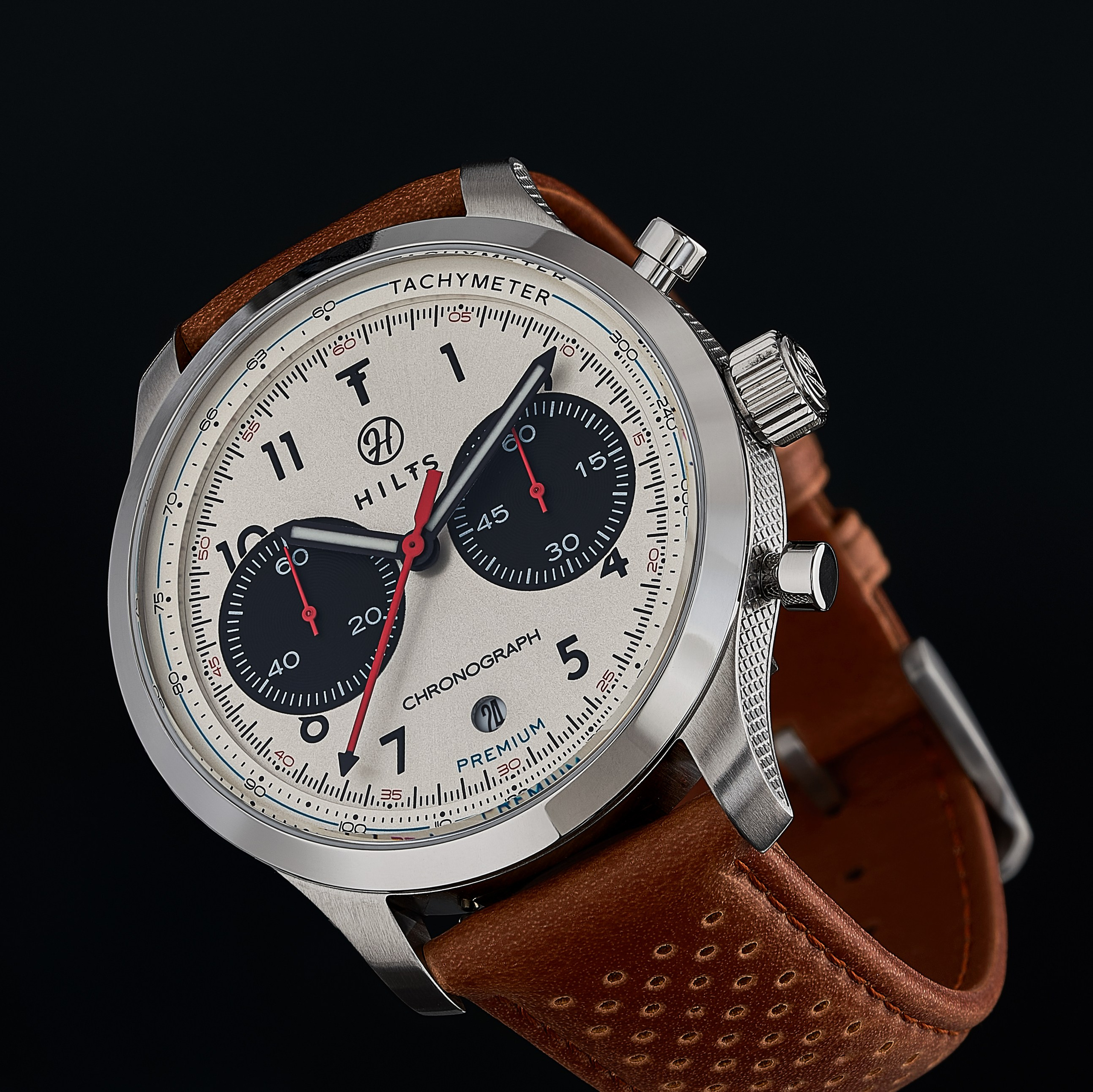
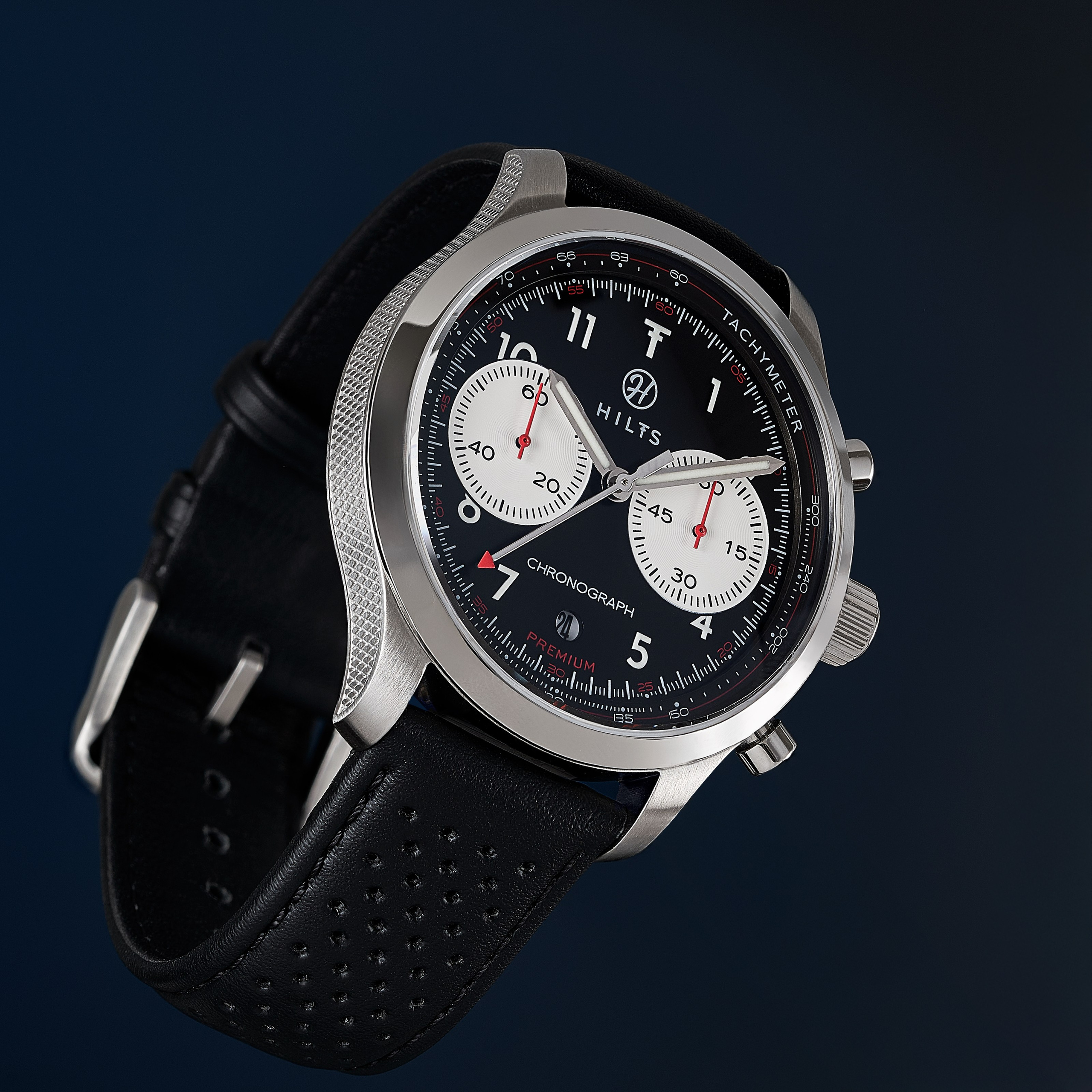
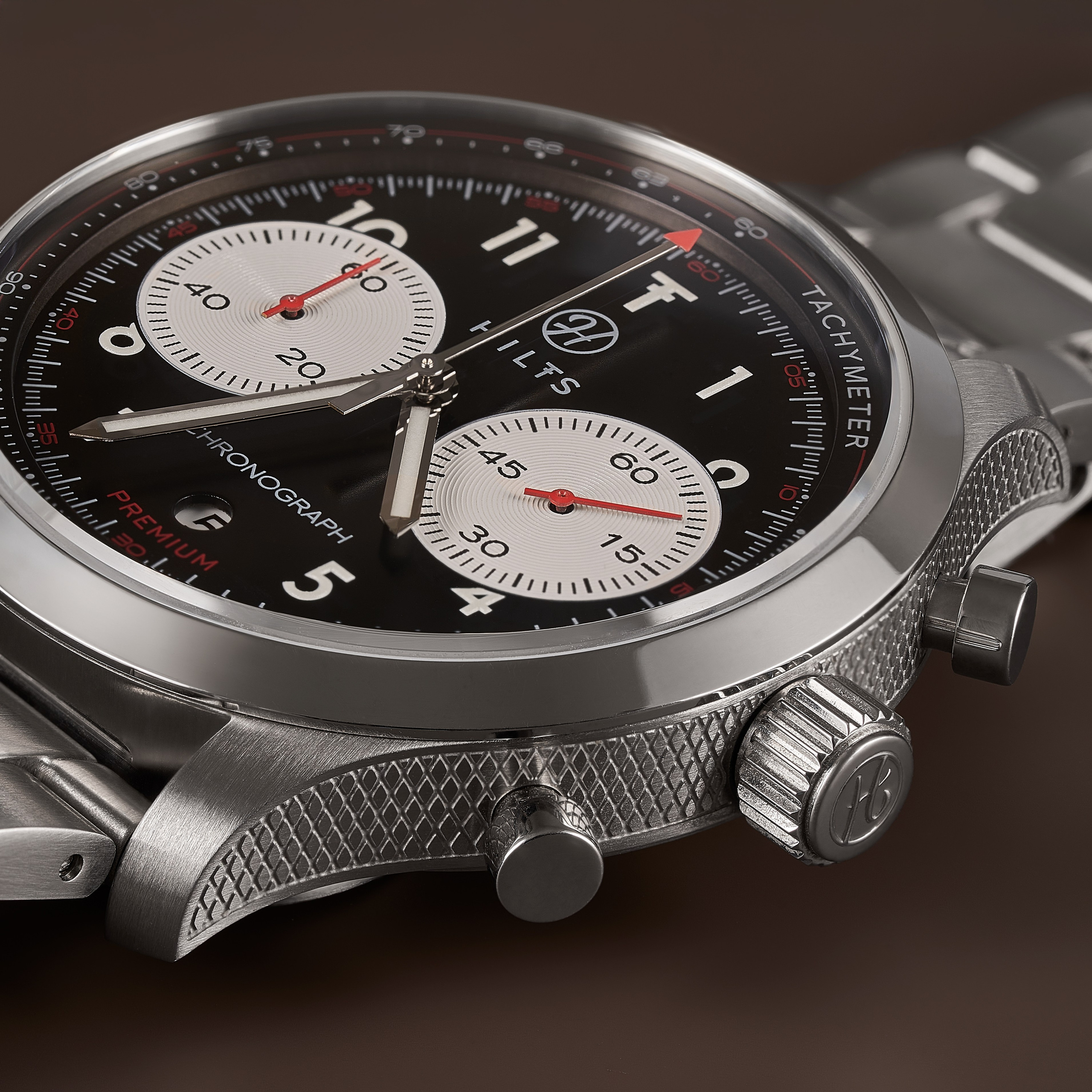
A watch carries two competing optical problems: the case needs something dark and something light to reflect in order to read as steel, and the crystal reflects exactly the same things on top of the dial. What gives the case its volume is what dirties the dial. Each piece is several captures under separate lighting, combined afterwards.
Four full days for four watches.
Said out loud it sounds bad, we know. In footwear, that same day gets you a hundred pairs.
But a watch is nothing like a shoe in any of the ways that matter here, and this collection needed four kinds of image that can’t be made on the same day.
Here’s which ones, and why.
Four images, four different questions
Think about how someone actually ends up buying a watch.
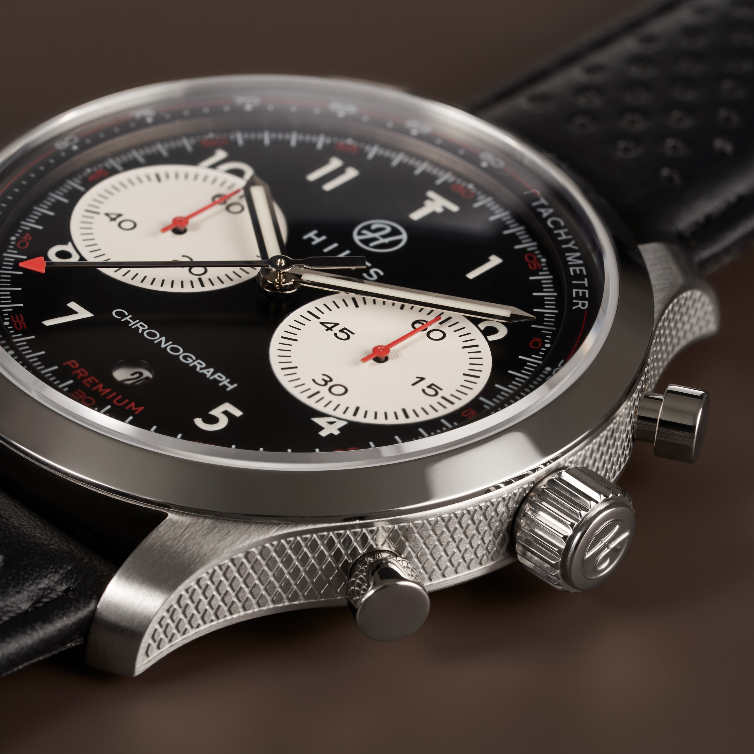
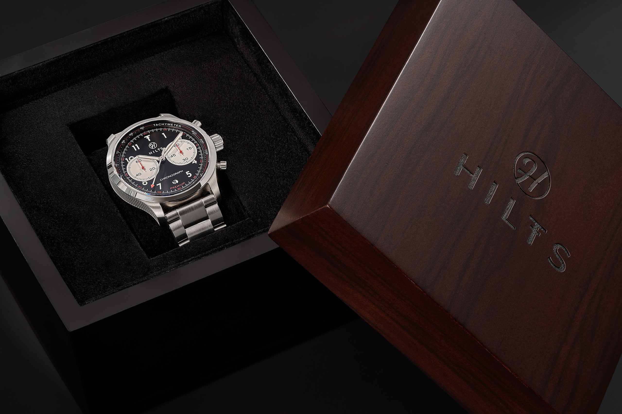
First they see it somewhere and like it. That’s what the advertising still life does: it explains nothing, gives no measurements, shows no clasp. It just makes someone want a watch they weren’t looking for.
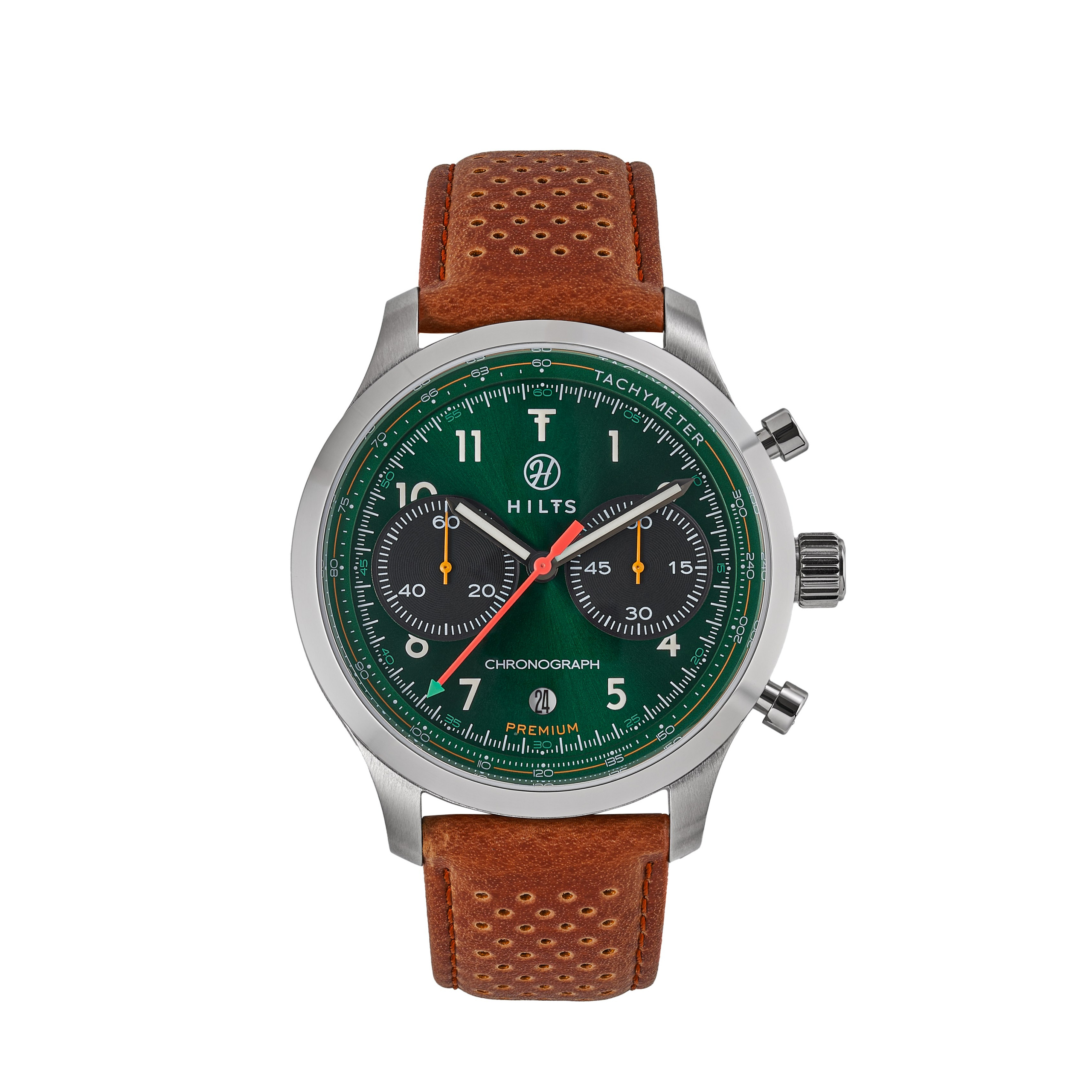
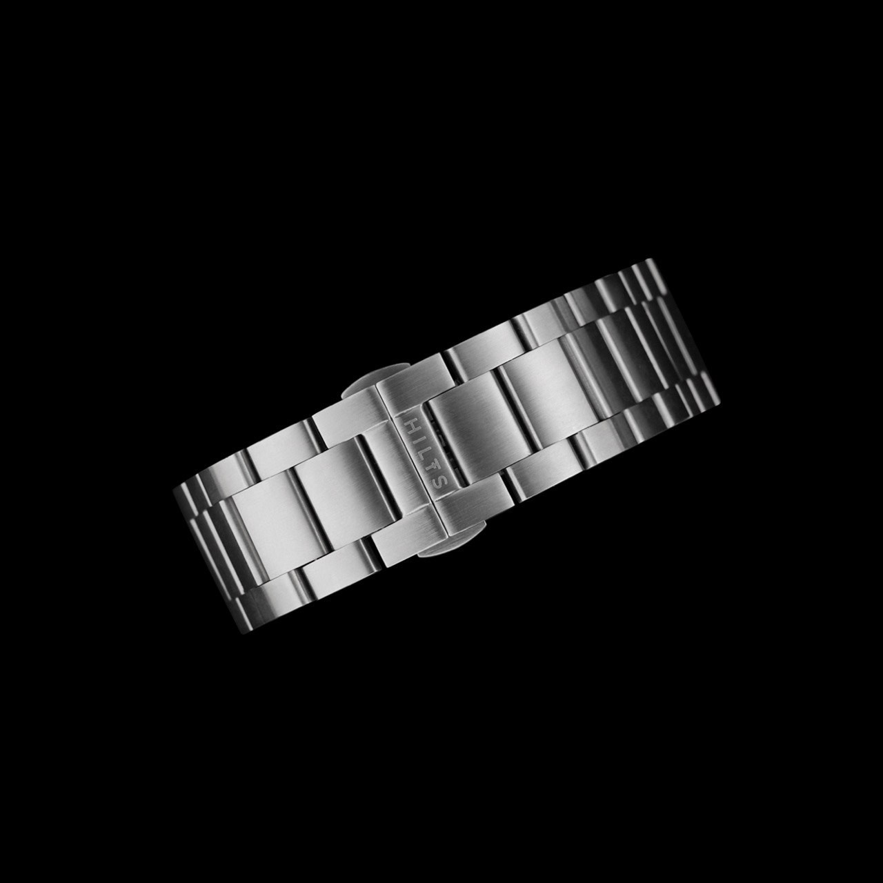
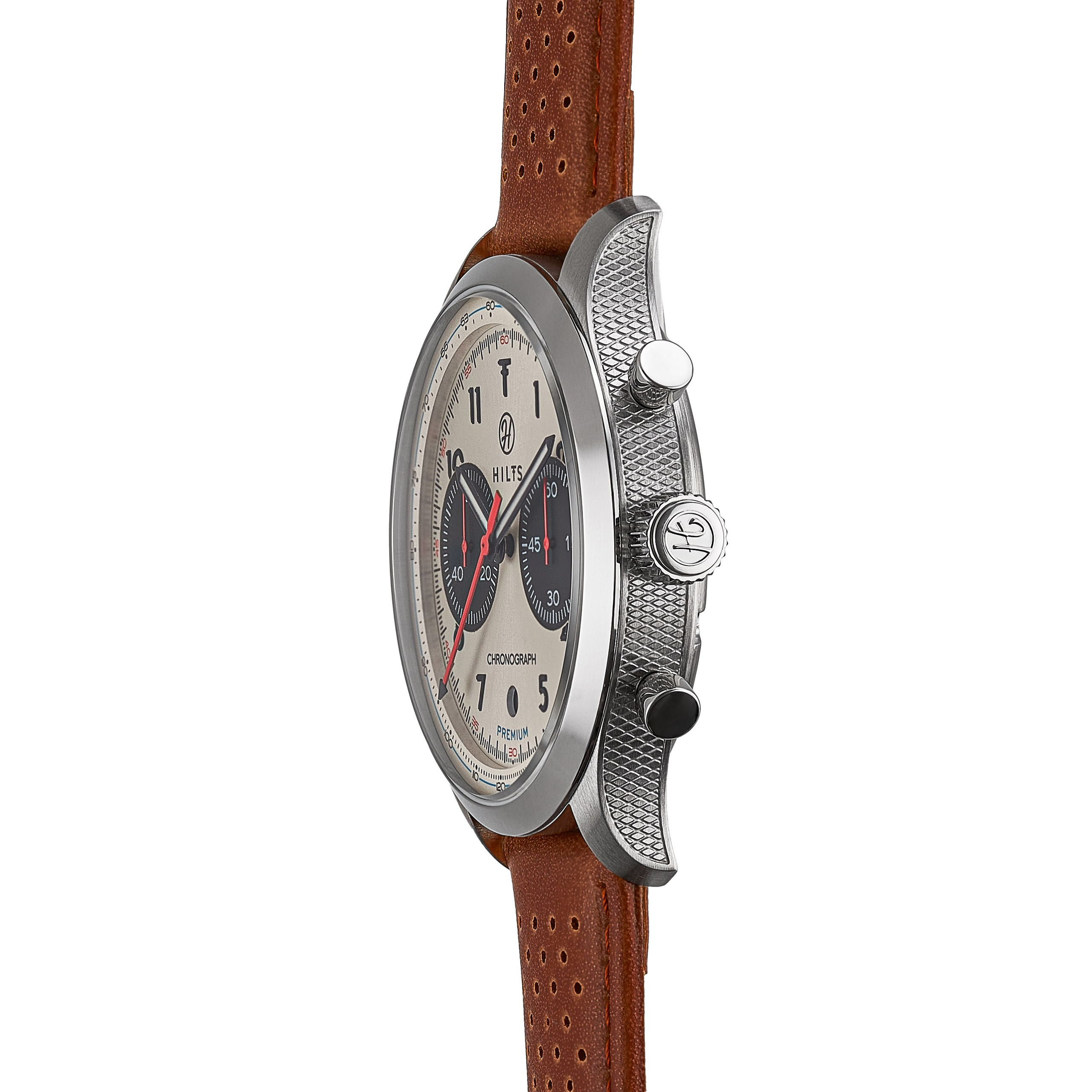
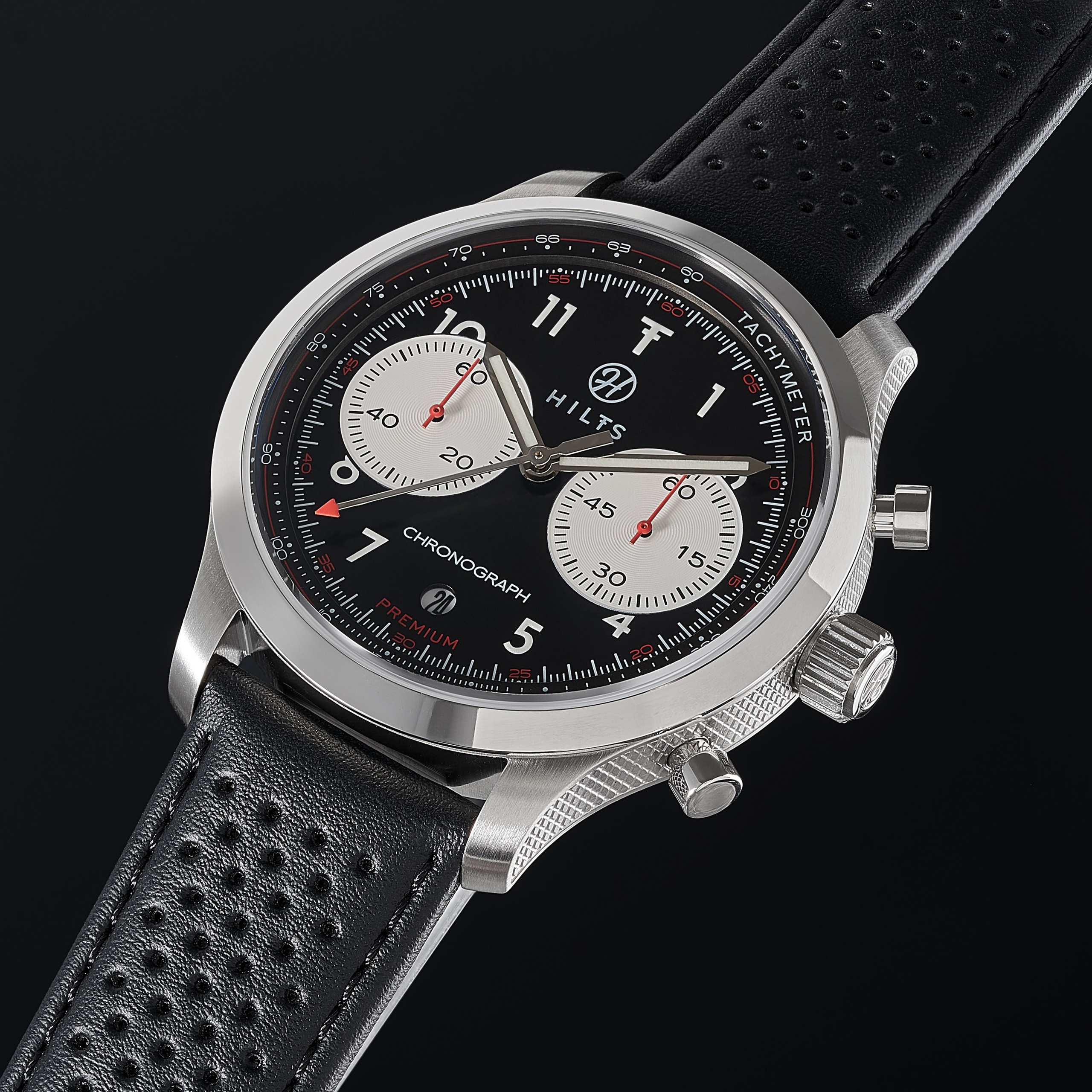
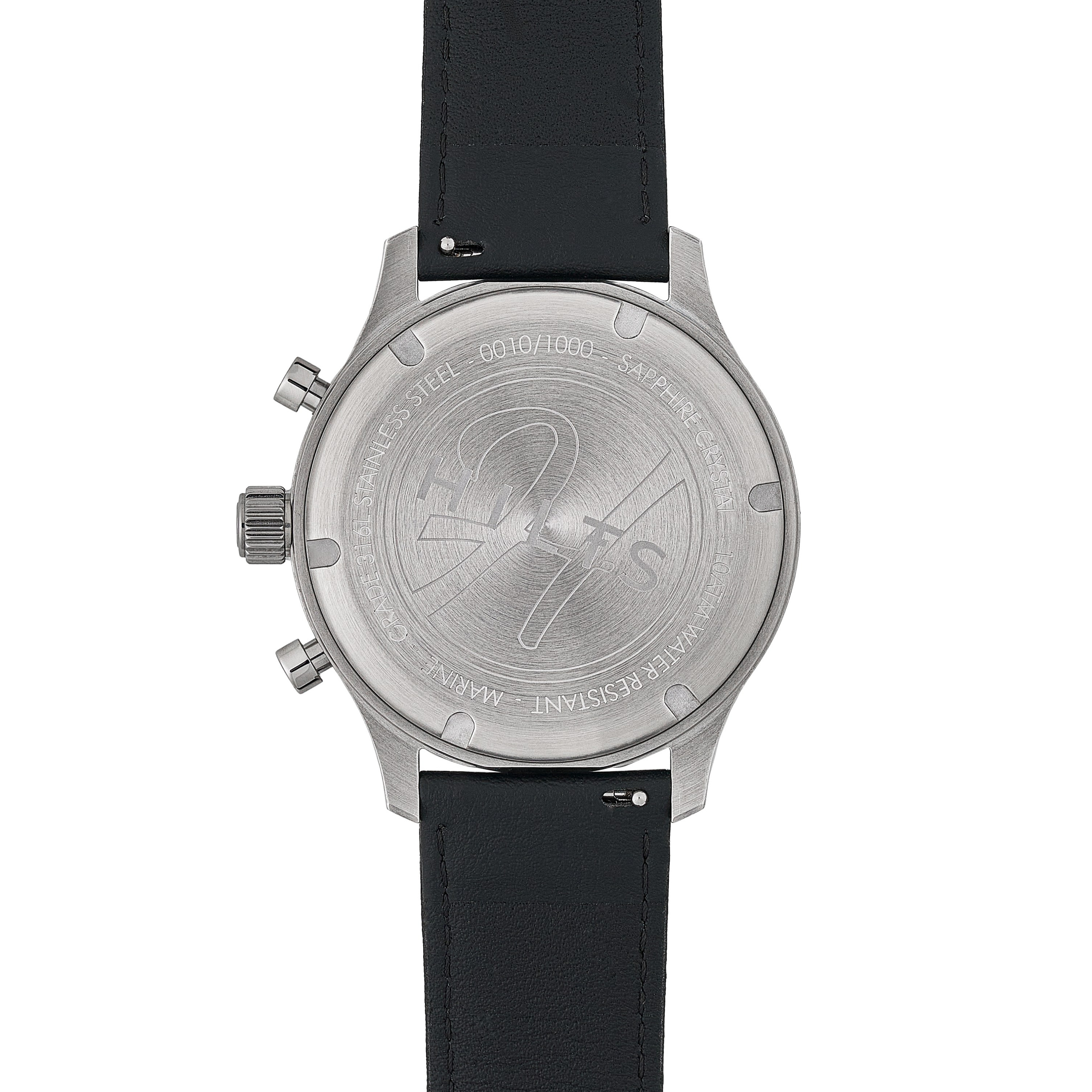
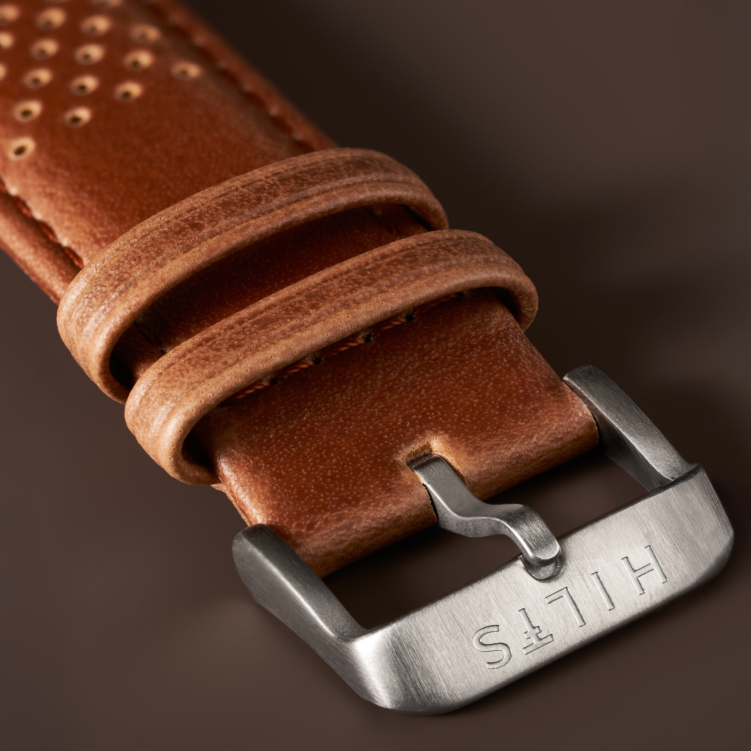
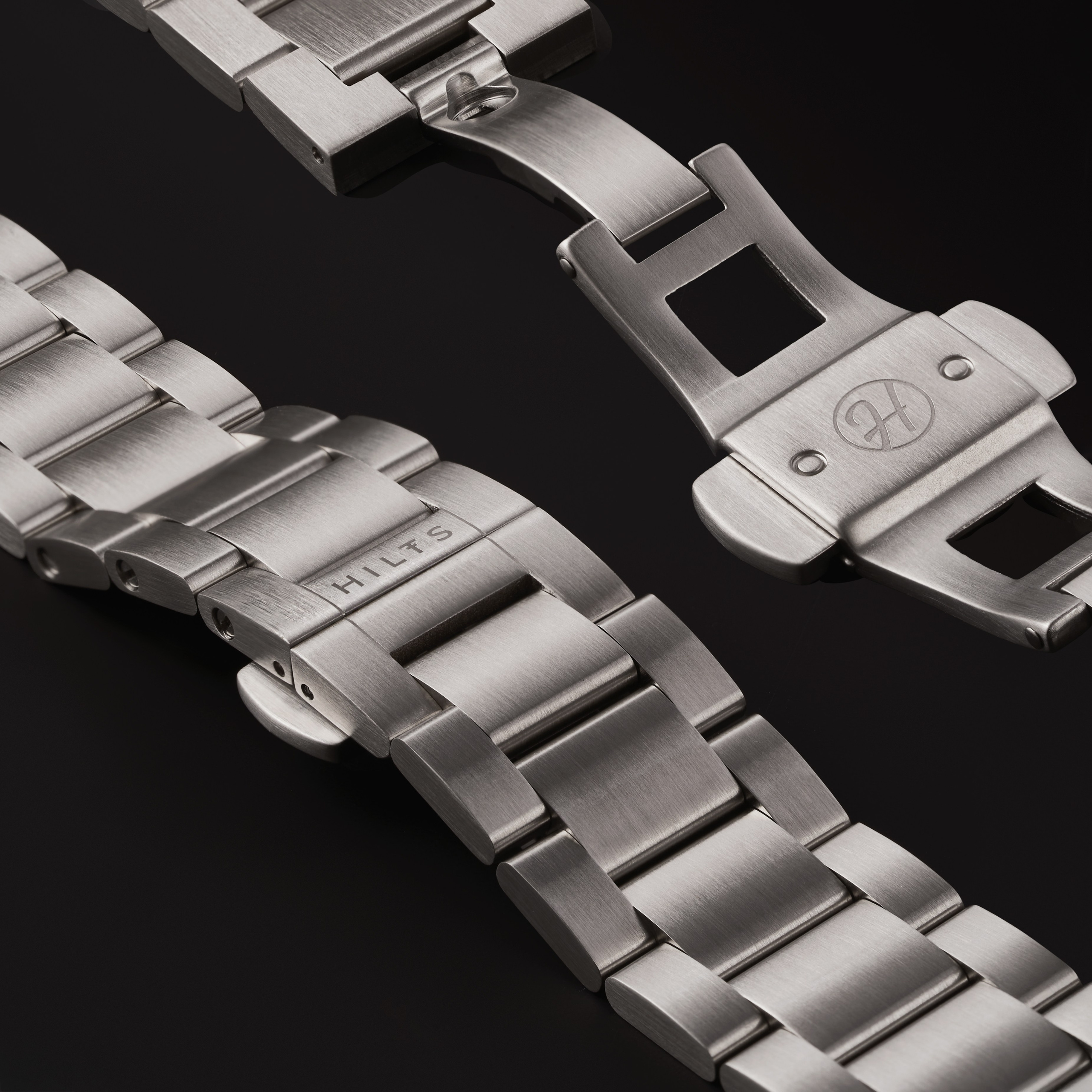
Then they land on your listing and start looking closely. That’s where the catalogue works: a dial you can read, a case that looks like steel rather than grey plastic, the real thickness in profile.
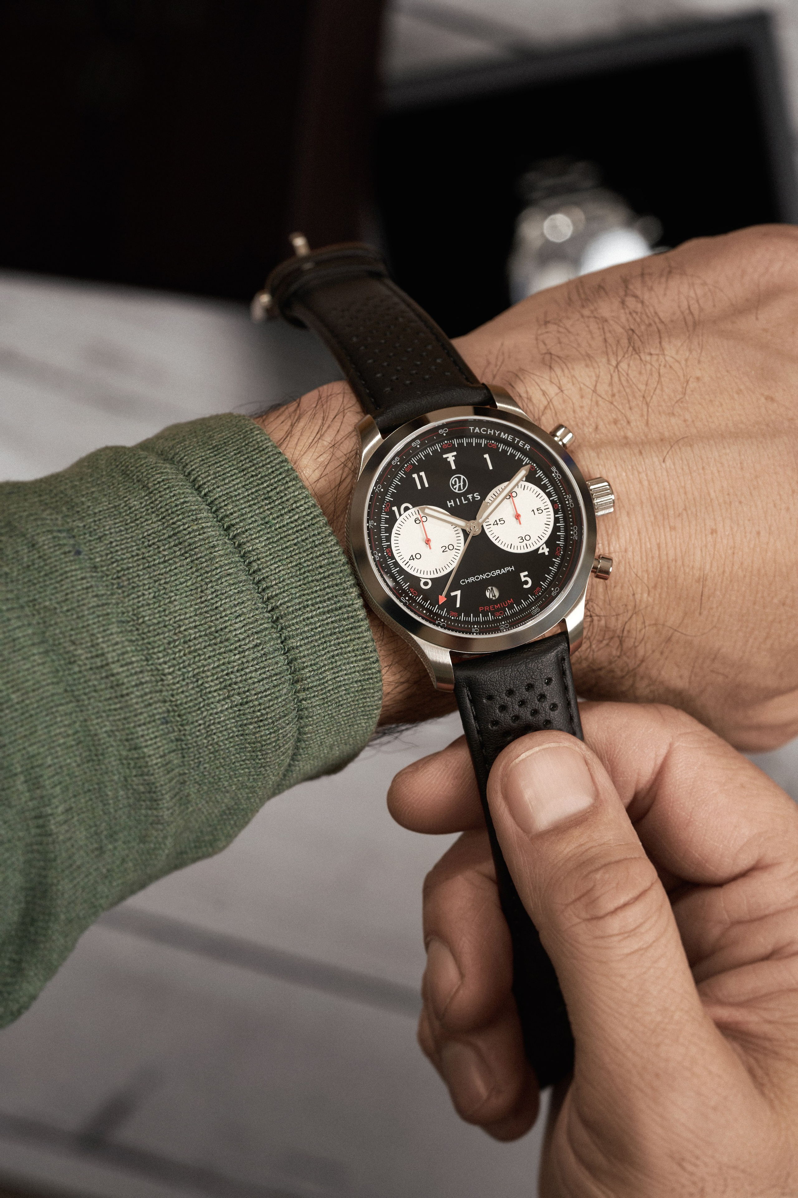
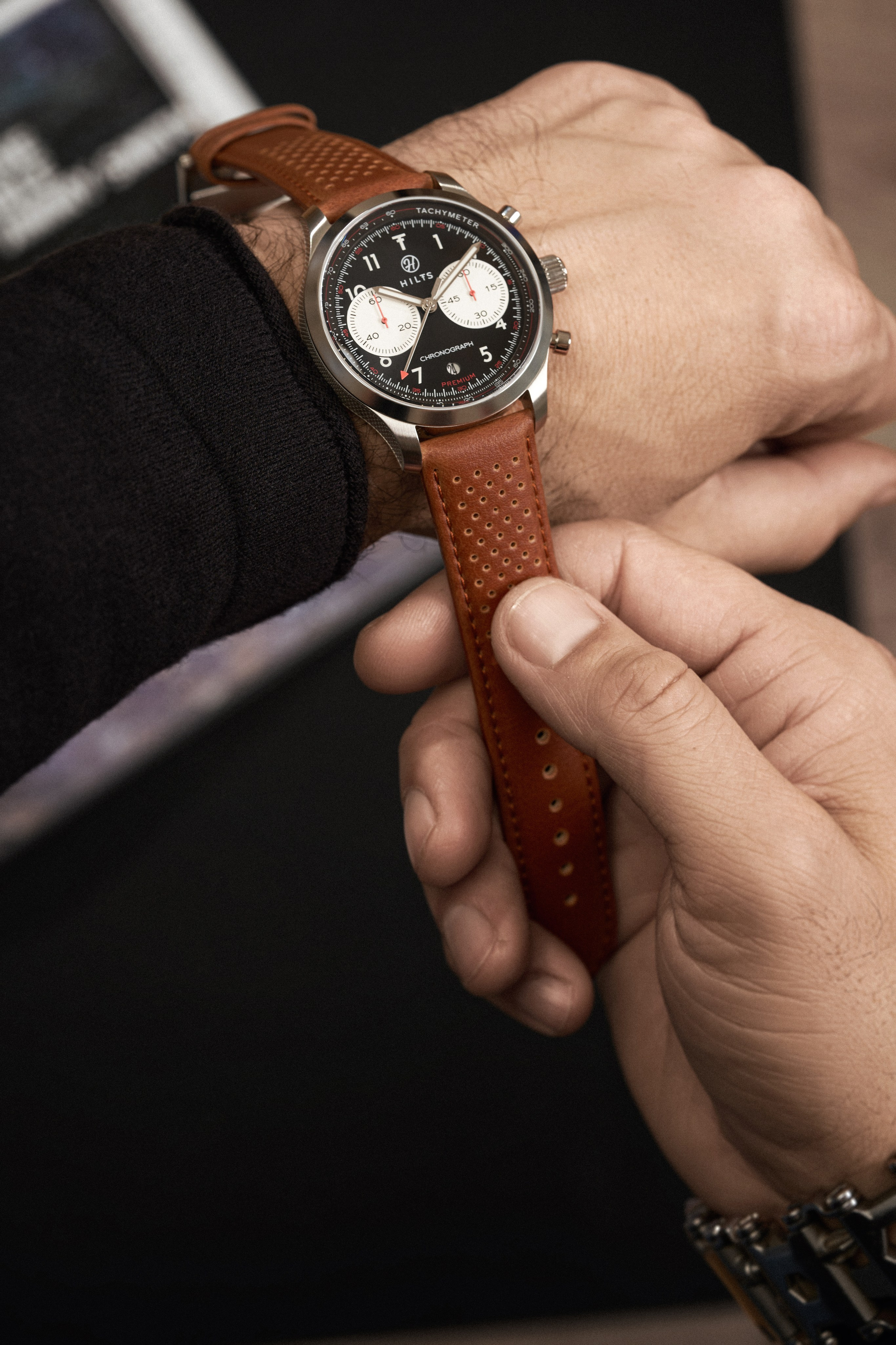
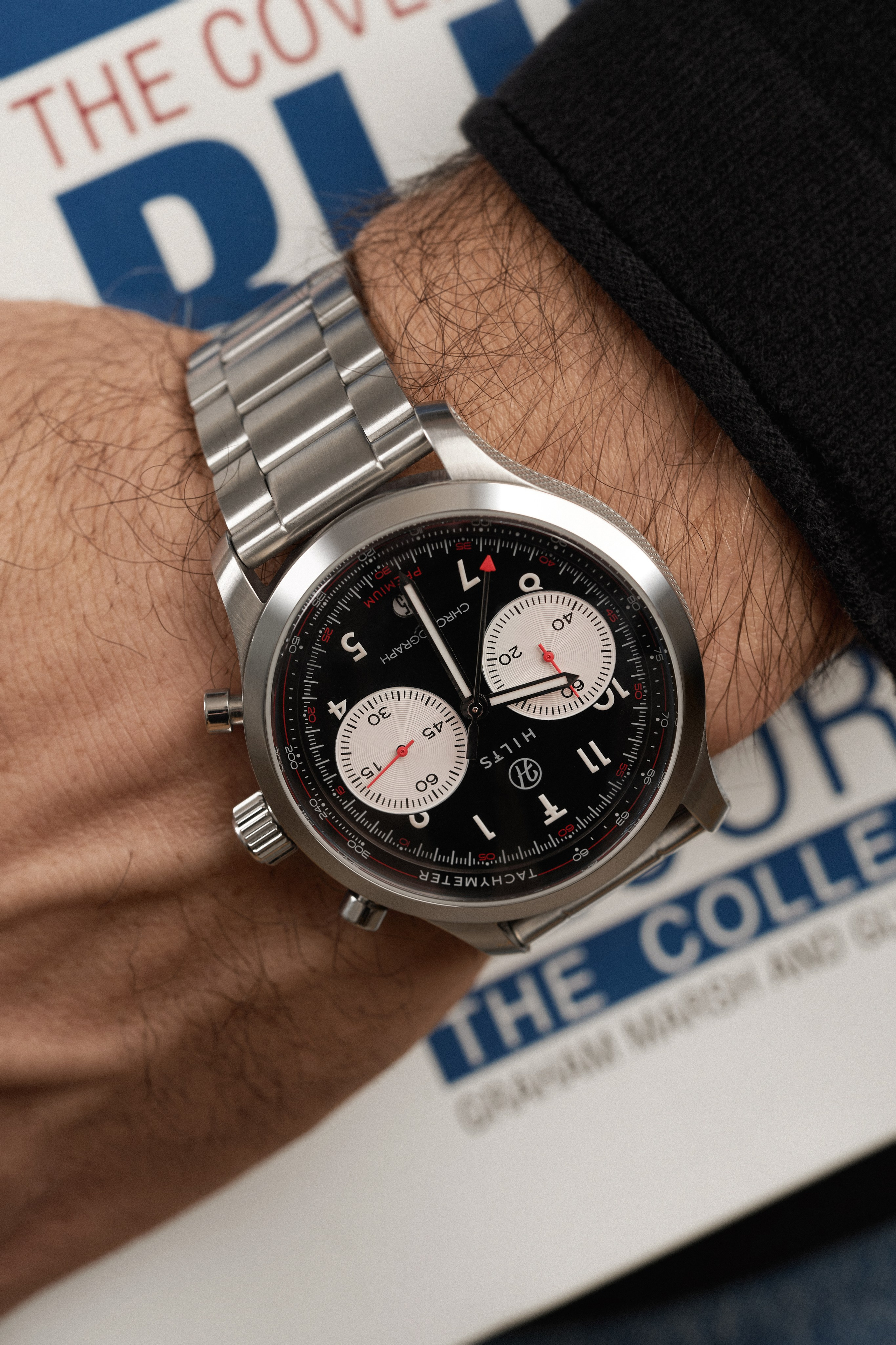
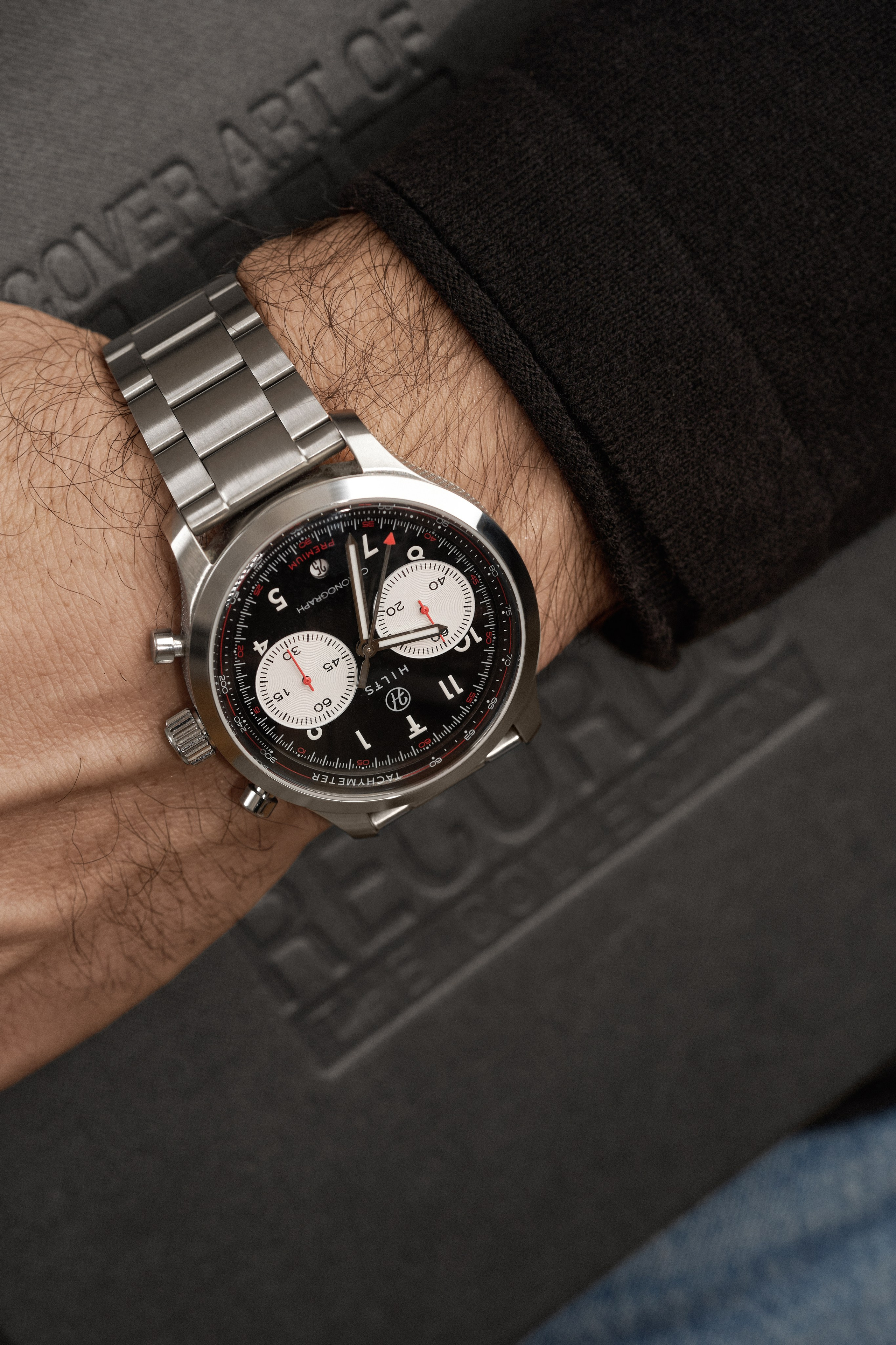
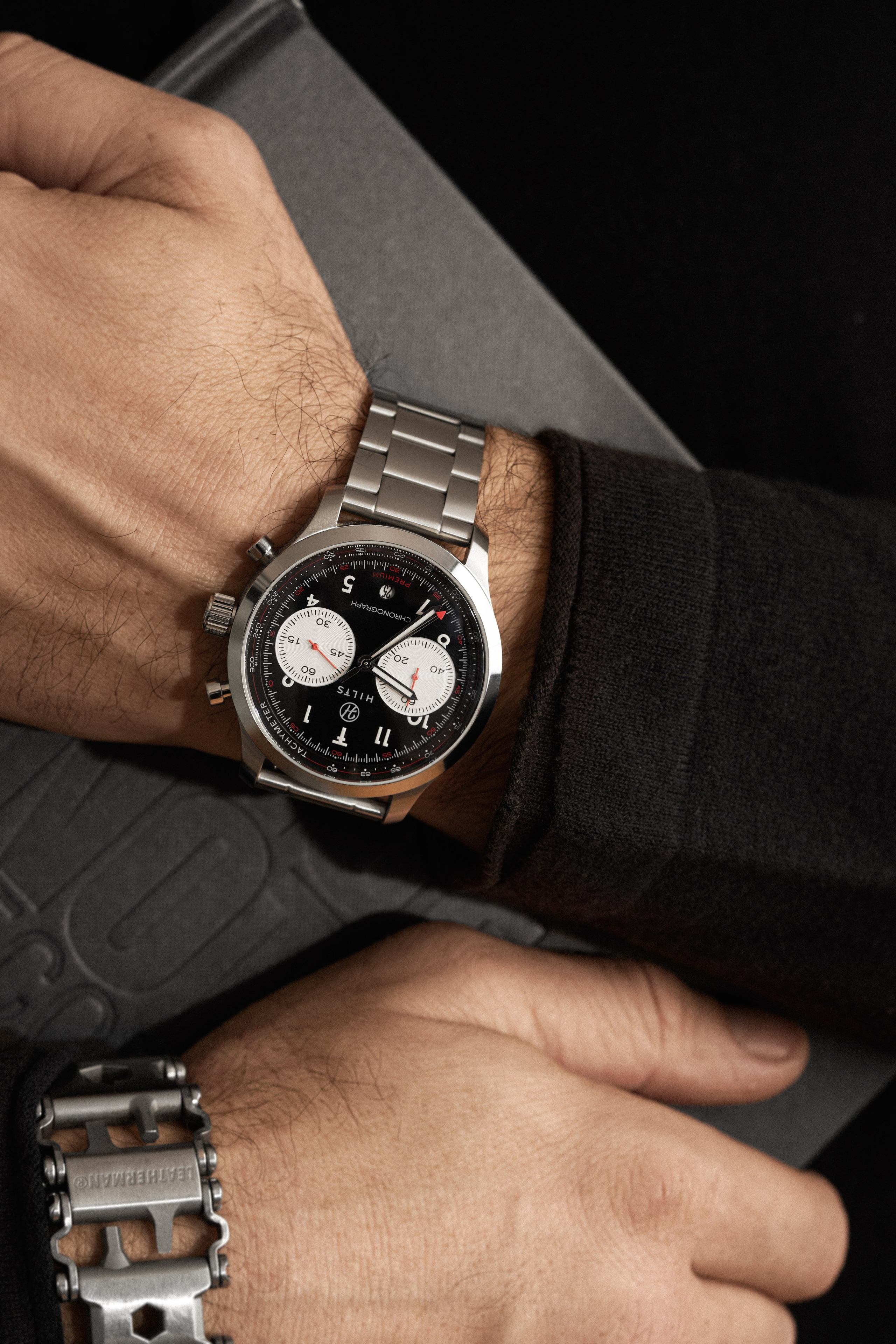
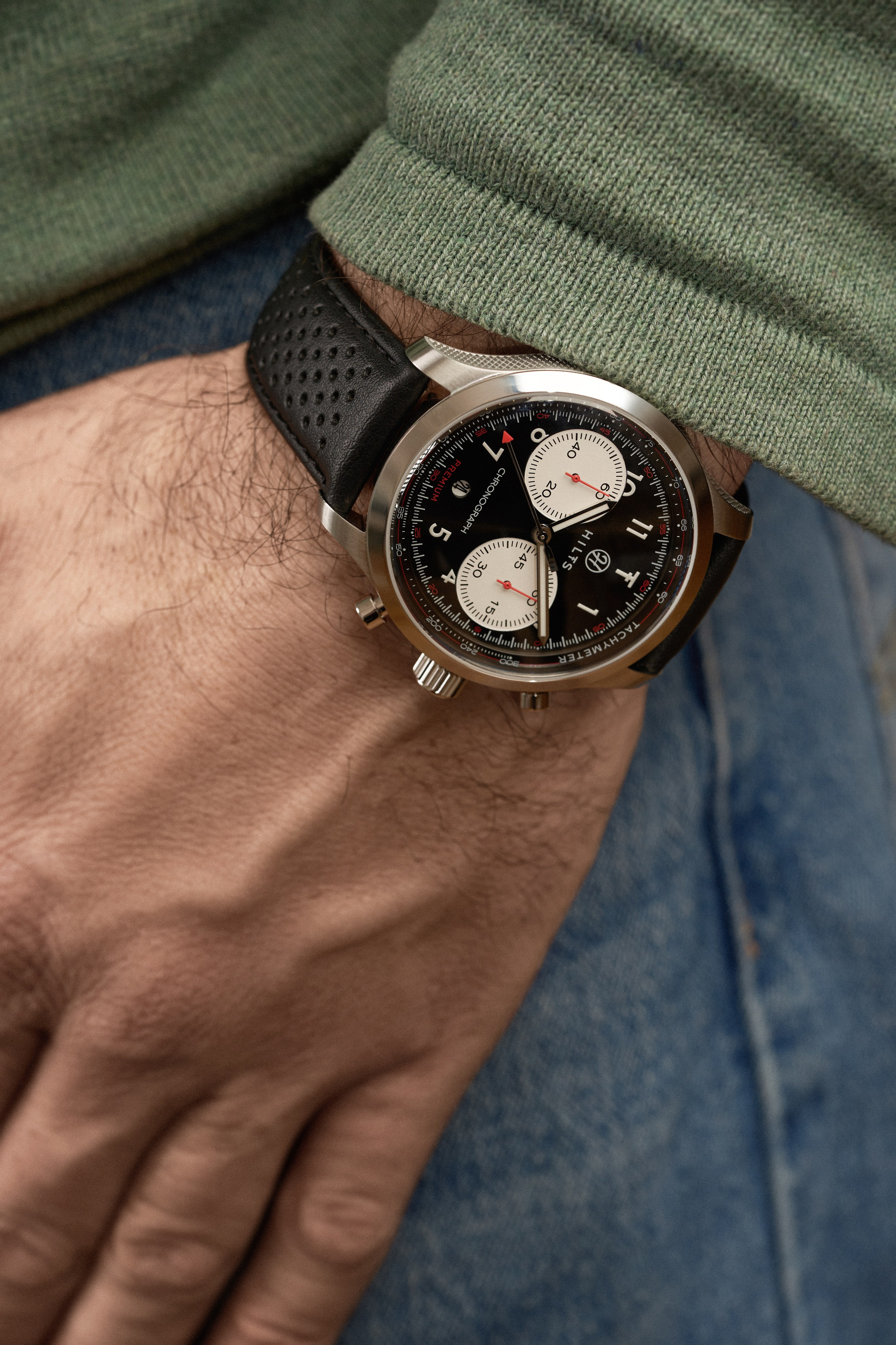
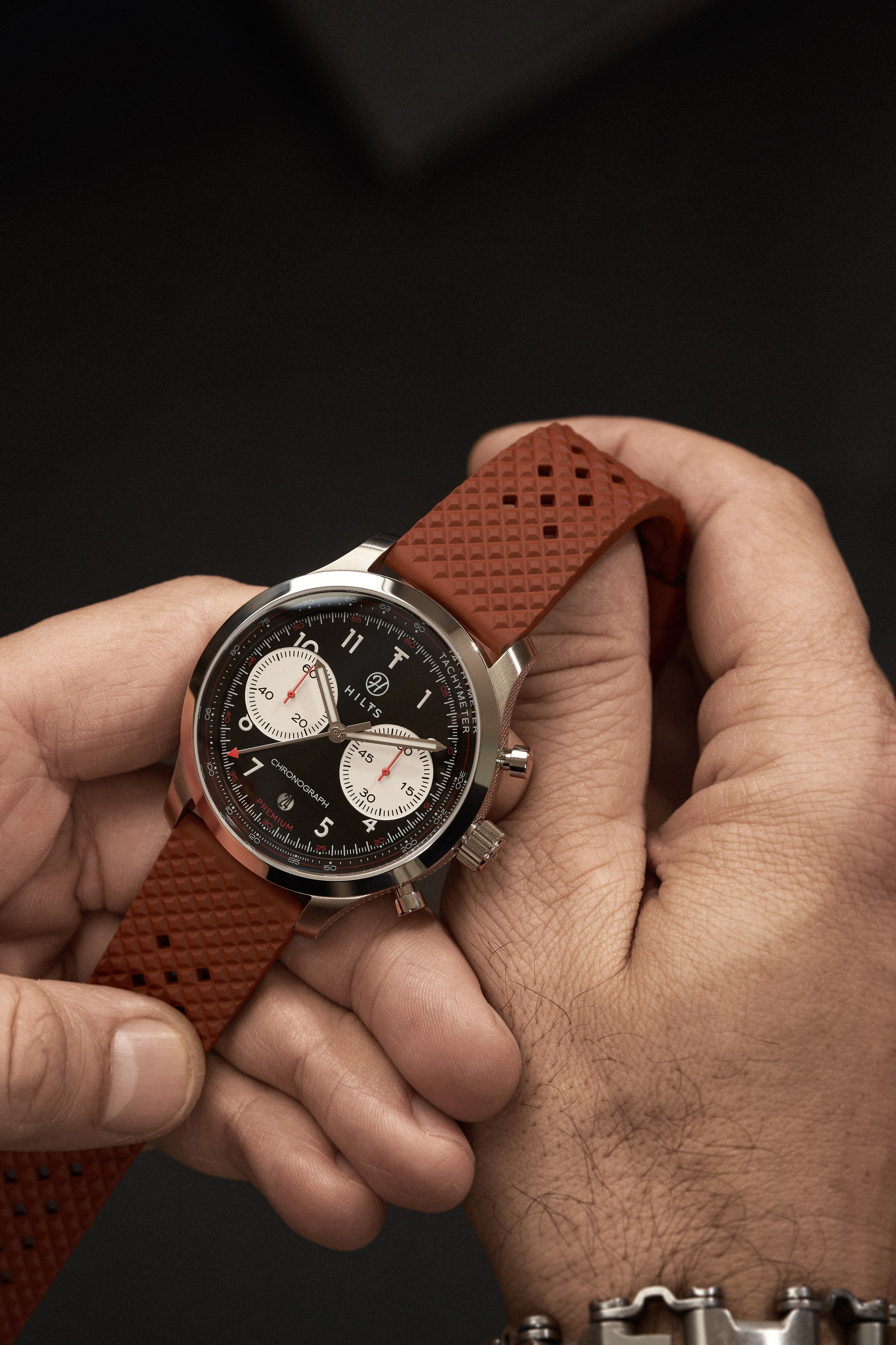
Then comes the doubt everyone has: how will it look on me? The model photograph answers that, and it’s the shot most missing from watch listings. Hardly anyone has it.
And if they’re still hesitating, the video shows what no still can: how the case settles when the wrist turns, how the bracelet moves, how the dial catches light at an angle.
Four moments. Four images. Ask one of them to do two of those jobs and it does both badly.
Why a watch eats a whole day
Here’s the technical part, and it’s worth understanding because it explains the invoice.
A watch has two surfaces that fight each other.
The case and bracelet are polished metal. For them to read as steel rather than a grey smudge, they have to reflect something light and something dark at once. That contrast inside the metal itself is what your eye reads as weight.
And the dial crystal reflects exactly the same things. Just on top of the hands, the indices and your logo.
What gives the case its volume is what dirties the dial.
So there isn’t one photo. There are several: one lighting setup for the metal, another so the dial reads clean under the crystal, sometimes a third for the bezel. All of it with the camera and the watch clamped, because if anything shifts a millimetre between captures, the combination doesn’t line up.
In footwear you build the light once and shoes go past it. Here every piece gets fought for on its own.
Which is why, if you compare a watch quote against a footwear one by dividing by the number of images, you aren’t comparing anything.
What gets decided on day one and never touched again
The time on the hands, for instance.
Almost everyone photographs at 10:10, and it isn’t superstition: the hands open in a V, they leave the logo clear and they don’t cover the date. But the important part comes next. Once chosen, that time stays for the whole collection. Why that convention exists and what’s myth in it is in why watches show 10:10 in photos.
Fifty watches each showing a different time look as bad in your store as fifty with the lighting changed. Nobody can say what’s wrong, but everybody notices something is.
Same with camera height, distance, the position of every light and the scheme per finish. Decided at the start, written down, applied to everything.
That’s what let four sessions with four different purposes still look like one catalogue.
Wrist video: the hardest session of the four
On the table the watch stays still. You clamp it, take all the time you need, change the light, go again.
On a wrist you can do none of that.
The angle at which the crystal doesn’t throw a reflection back at you is narrow. A few degrees off and the window shows up on the dial, or the tripod, or the ceiling.
Now add that the hand has to stay right there, because we’re filming rather than firing bursts you can pick from later.
And that it also has to look natural. A tense hand looks tense, however well the watch is lit.
Three things at once, held through the whole take. Holding a watch like that isn’t something anyone can do: it’s a craft, odd as that sounds.
And then there’s the video part, which surprises even people in the industry.
When you take a photo and a fingerprint shows up on the steel, it gets removed in post. Dull, but solvable.
In video it doesn’t. Twenty-five frames a second, and cleaning each one makes no economic sense at all. So the watch has to be genuinely clean, and stay that way through the whole take.
The problem is that a person is wearing it.
Between takes it has to be positioned, turned, adjusted. And polished steel keeps every fingerprint you leave on it. The micro-scratches on a display piece, the ones you can’t see in your hand, show up whole in macro under hard light.
So the day ran like this: before every single take, the assistant cleaned the watch of dust and fingerprints. Every one. Not once at the start.
And there was a second thing that repeated on every take, and nobody sees this one coming.
The watch runs. The hands move while you’re filming, and a take lasts considerably longer than a shutter. So before every take, the hands had to be set back to 10:10.
Choosing that time on day one looks like a decision. In video it’s a task, and it repeats all day.
On top of that, video needs continuous light rather than flash: light that heats and stays on the whole time, revealing more than a burst would.
Which is why video isn’t the photo but moving. It’s a different thing, and the most demanding of the four sessions.
What the brand walked away with, besides the photos
The finished images, ready to use, in the formats each destination needs. And framed from the shoot with several in mind: what runs on the listing, the website and social all comes from the same frame.
All the criteria written down: light values, positions, file naming. The next collection doesn’t start from zero.
Rights settled before shooting, with channels and territory in writing. So the material can move without having to discuss it again.
What this proves
Not the quality of one photo. You can see that by looking, and you don’t need us to tell you.
What it proves is that a collection needs different images for different things, and that all of them can still belong to the same catalogue if the criteria get fixed on day one.
Four sessions, four purposes, and nothing in the set looks like it came from somewhere else.
Got a collection to photograph?
Tell us what it is, how many pieces and when you need it.