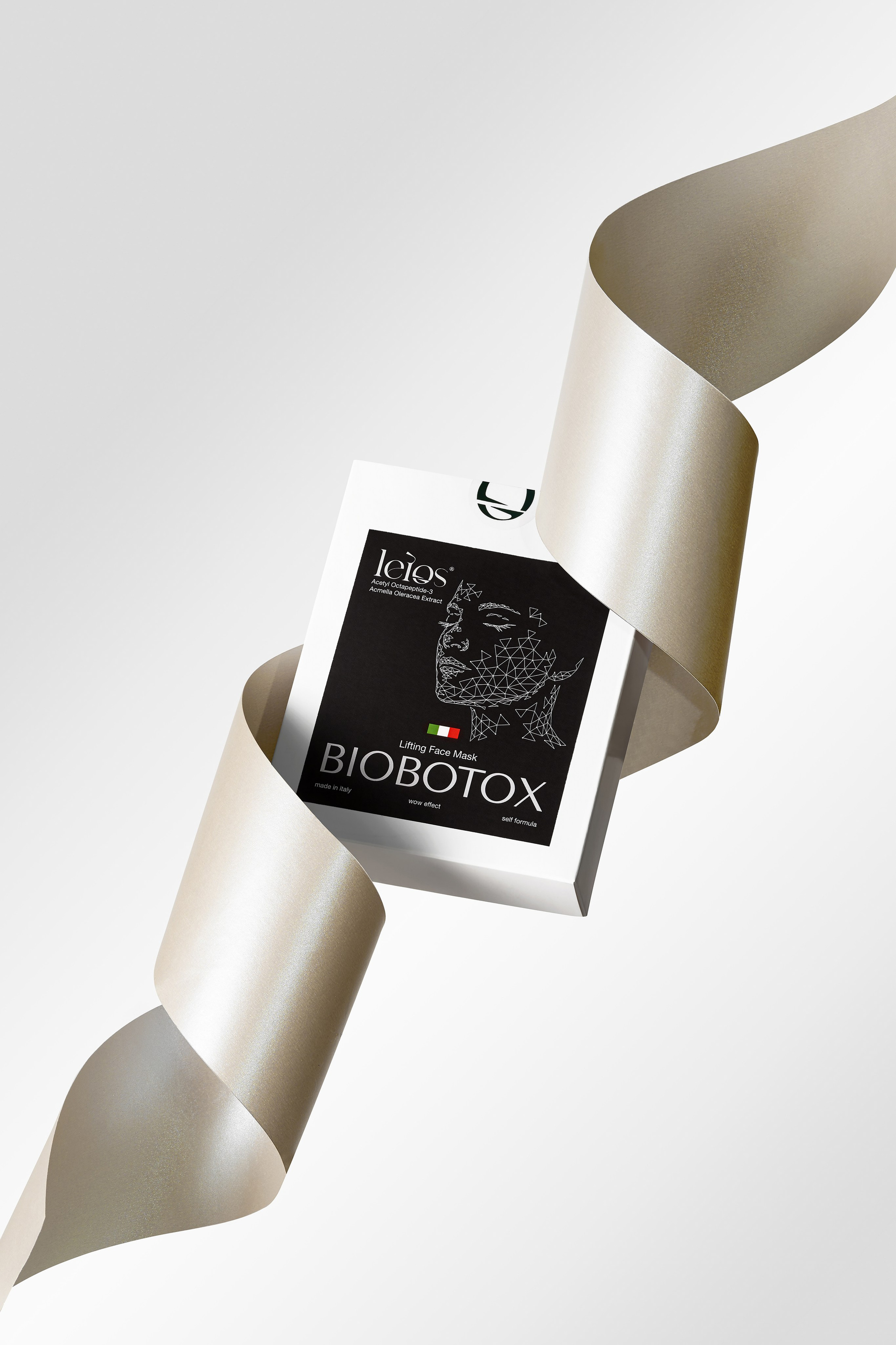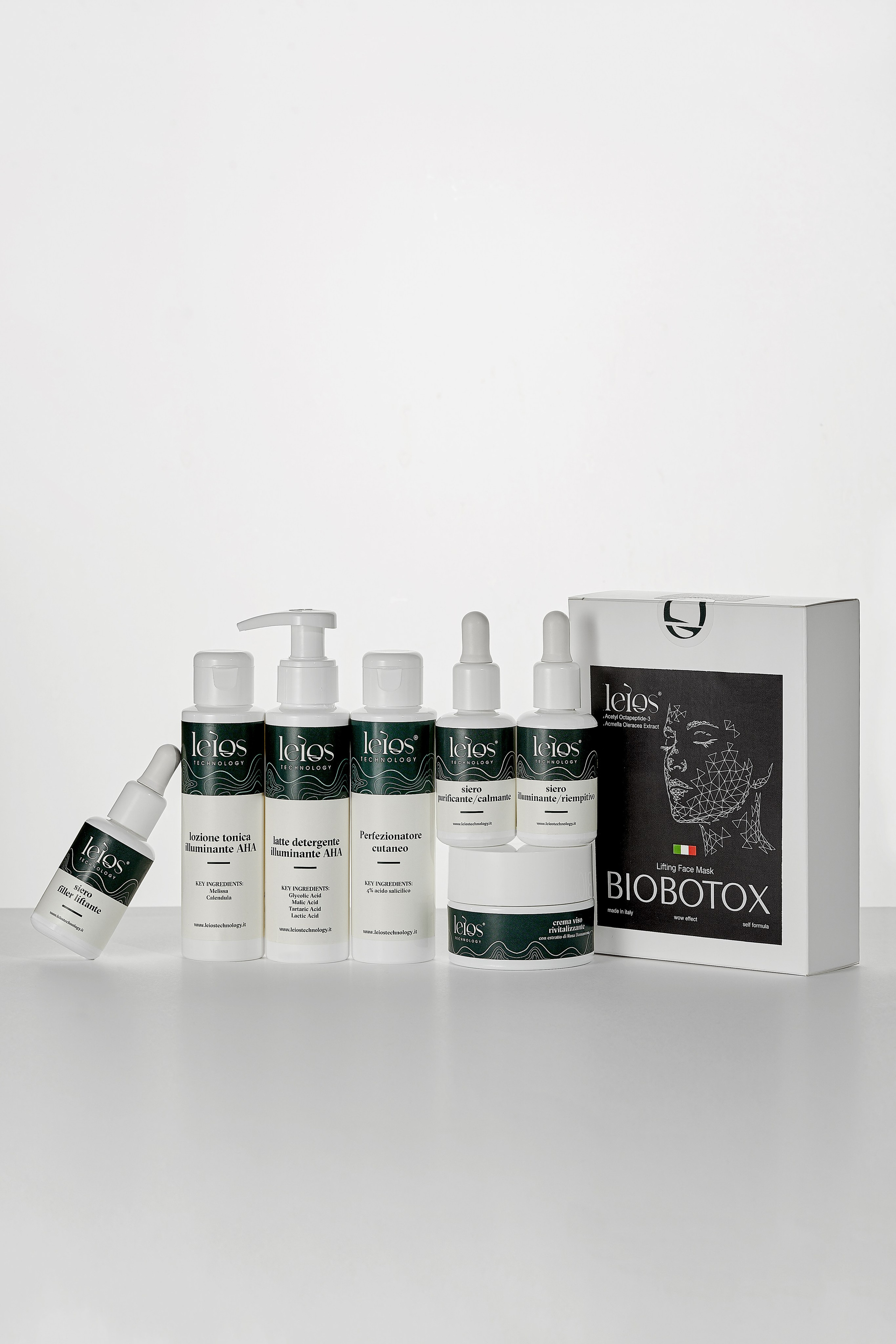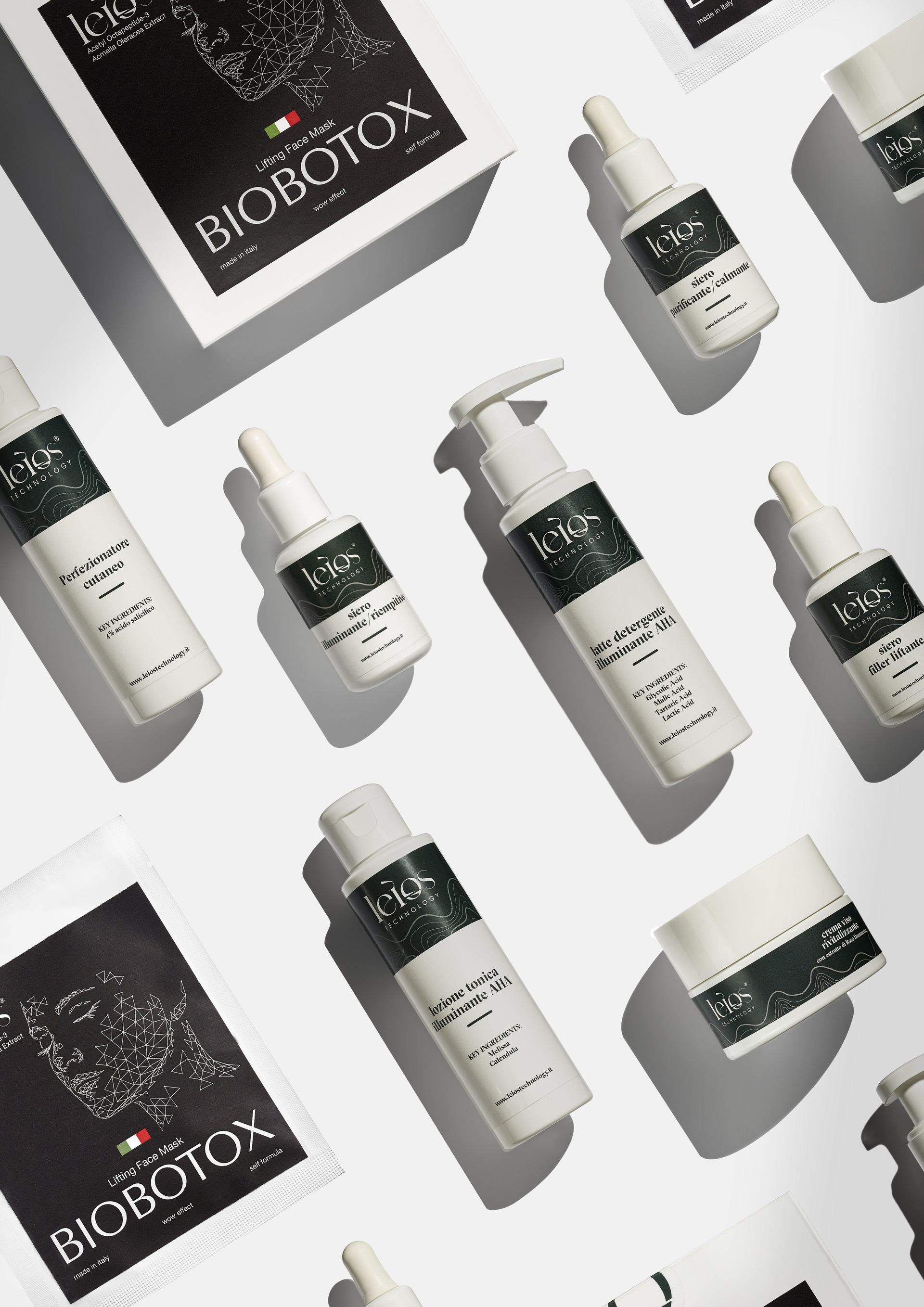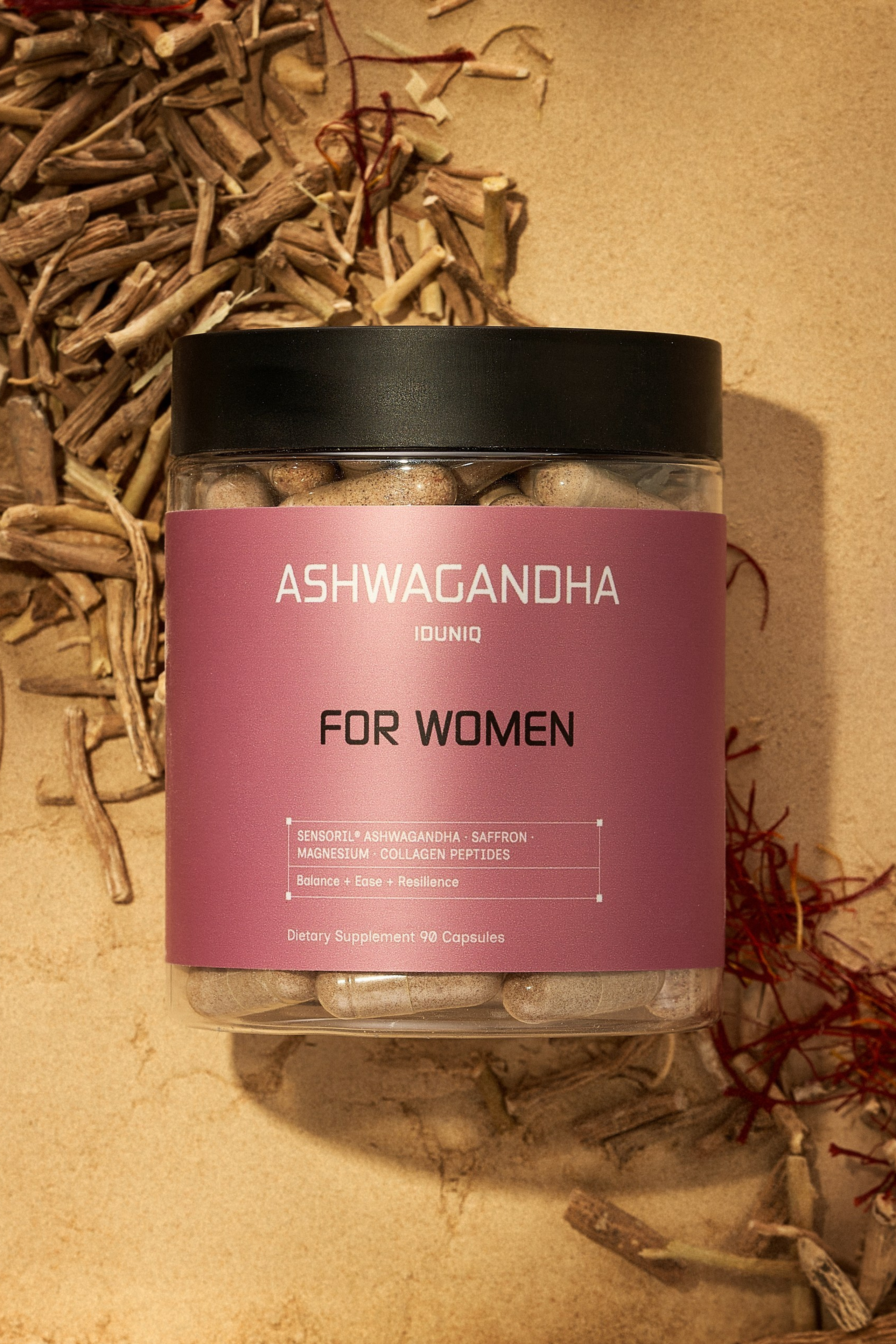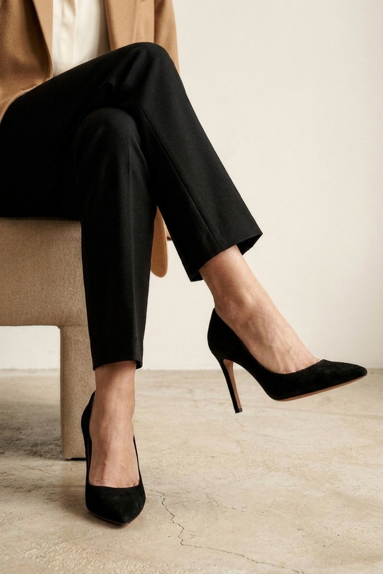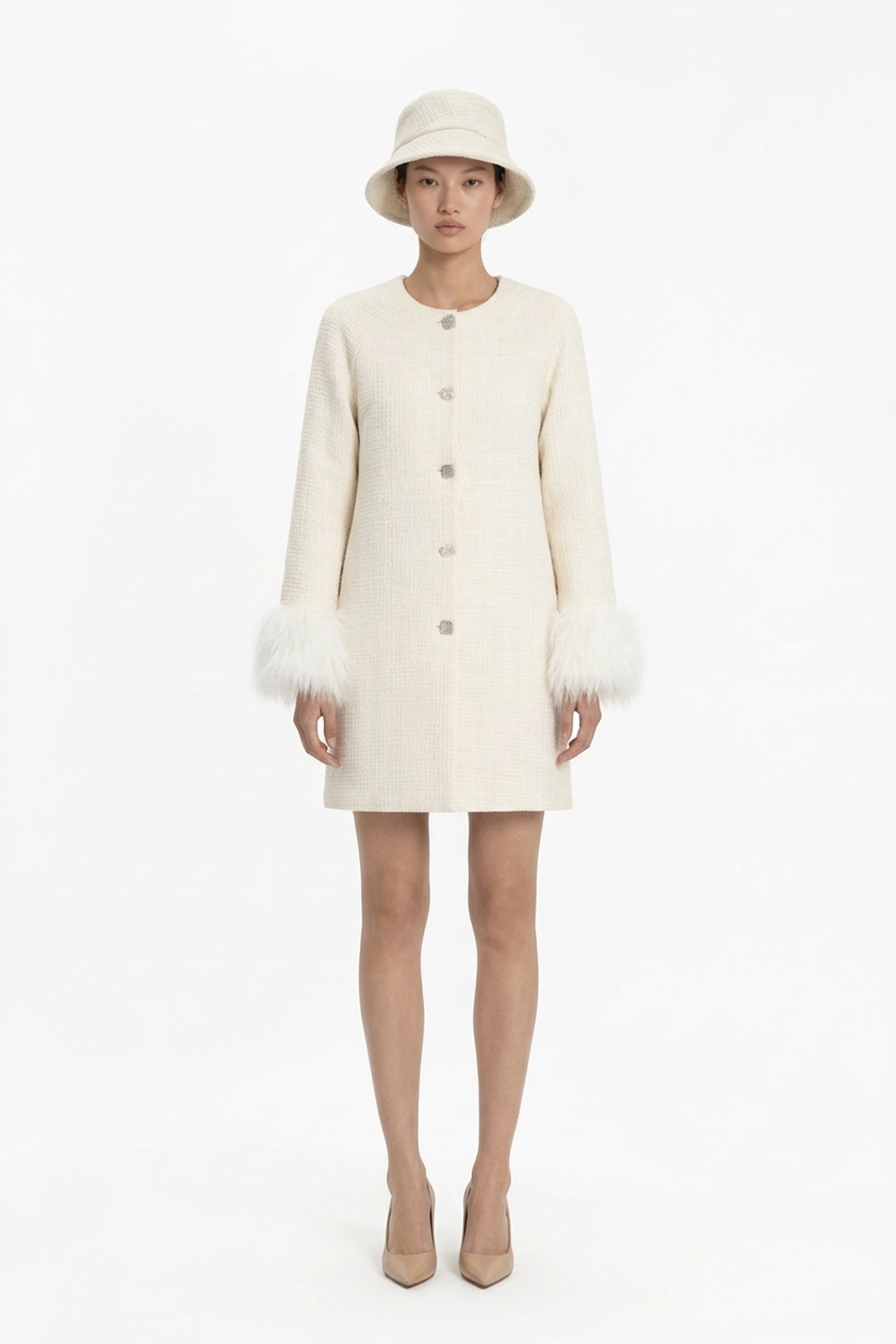

Skincare is bought on a feeling: how the texture sits, what the shade really is, whether the packaging feels like something worth the price. That’s the one thing a customer can’t check before the parcel arrives.
What had to be right
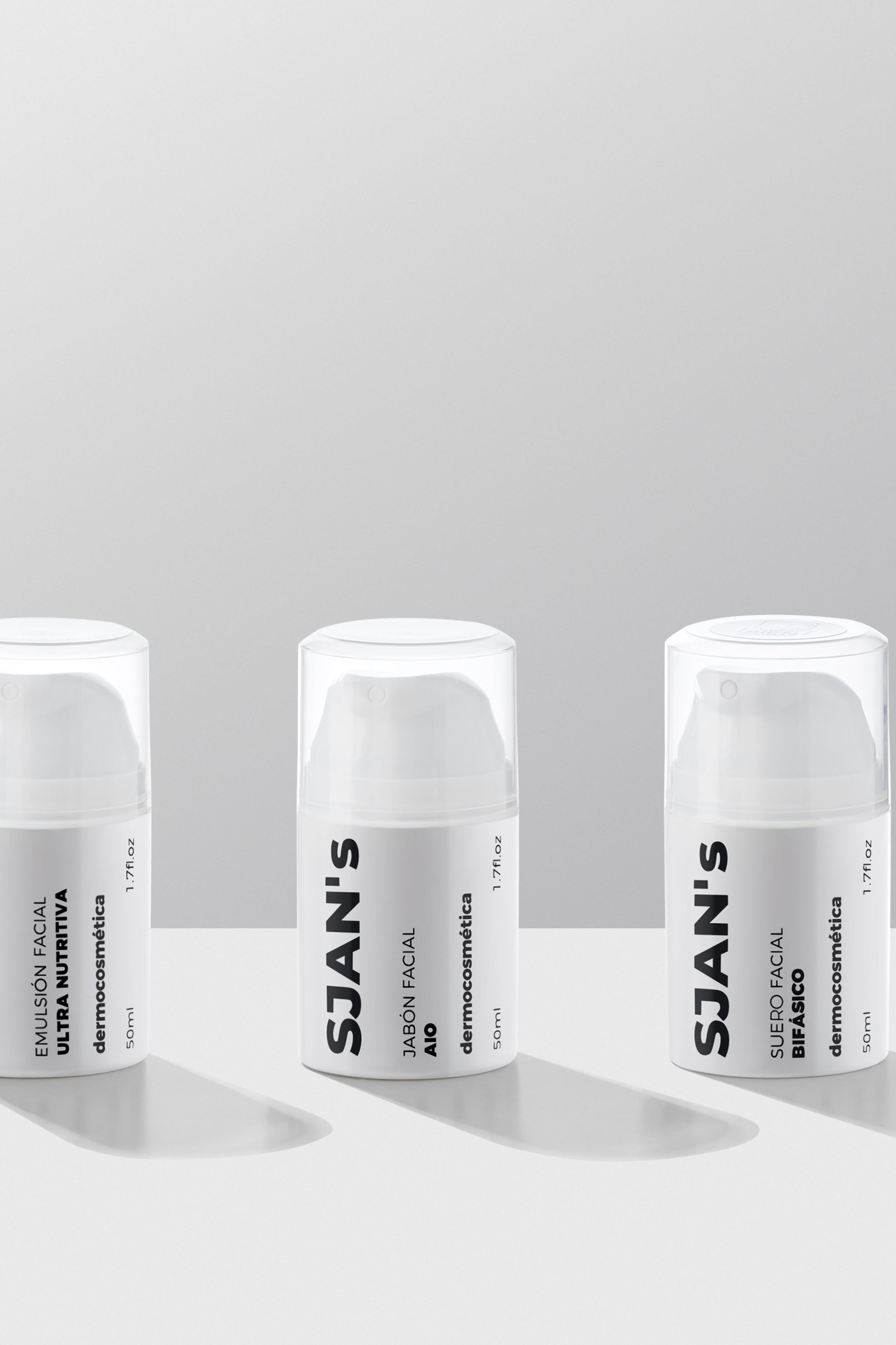
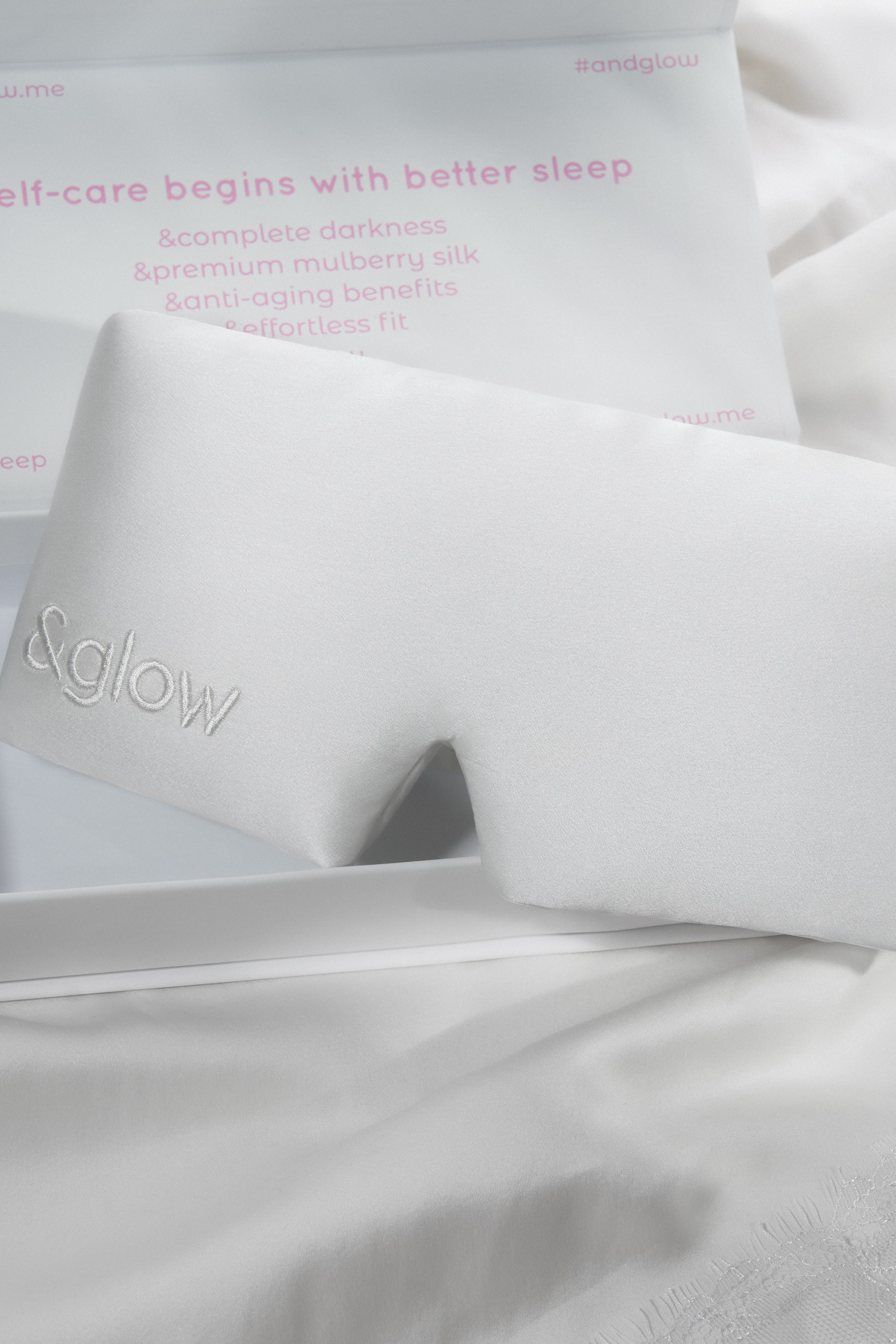
The real colour of the product, not a version corrected until it looks nice. The texture readable up close, because that’s what people zoom into. Packaging shot so the finish shows — matte, foil and gloss behave differently under the same light.
What we shot
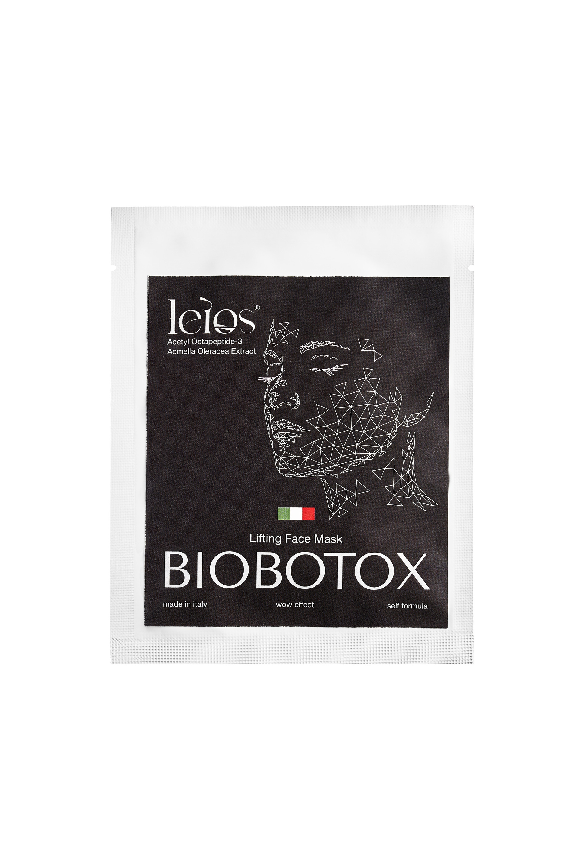
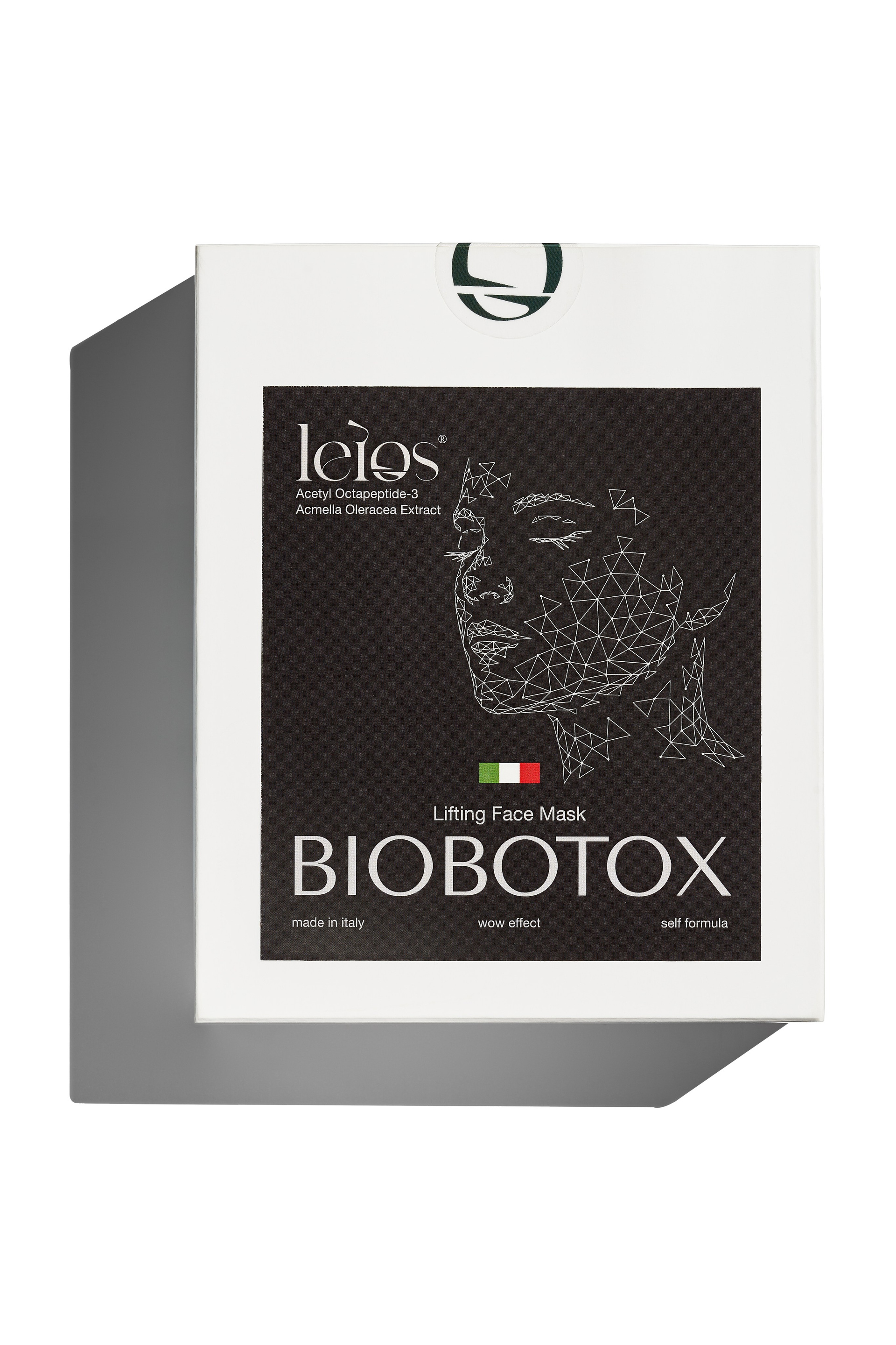
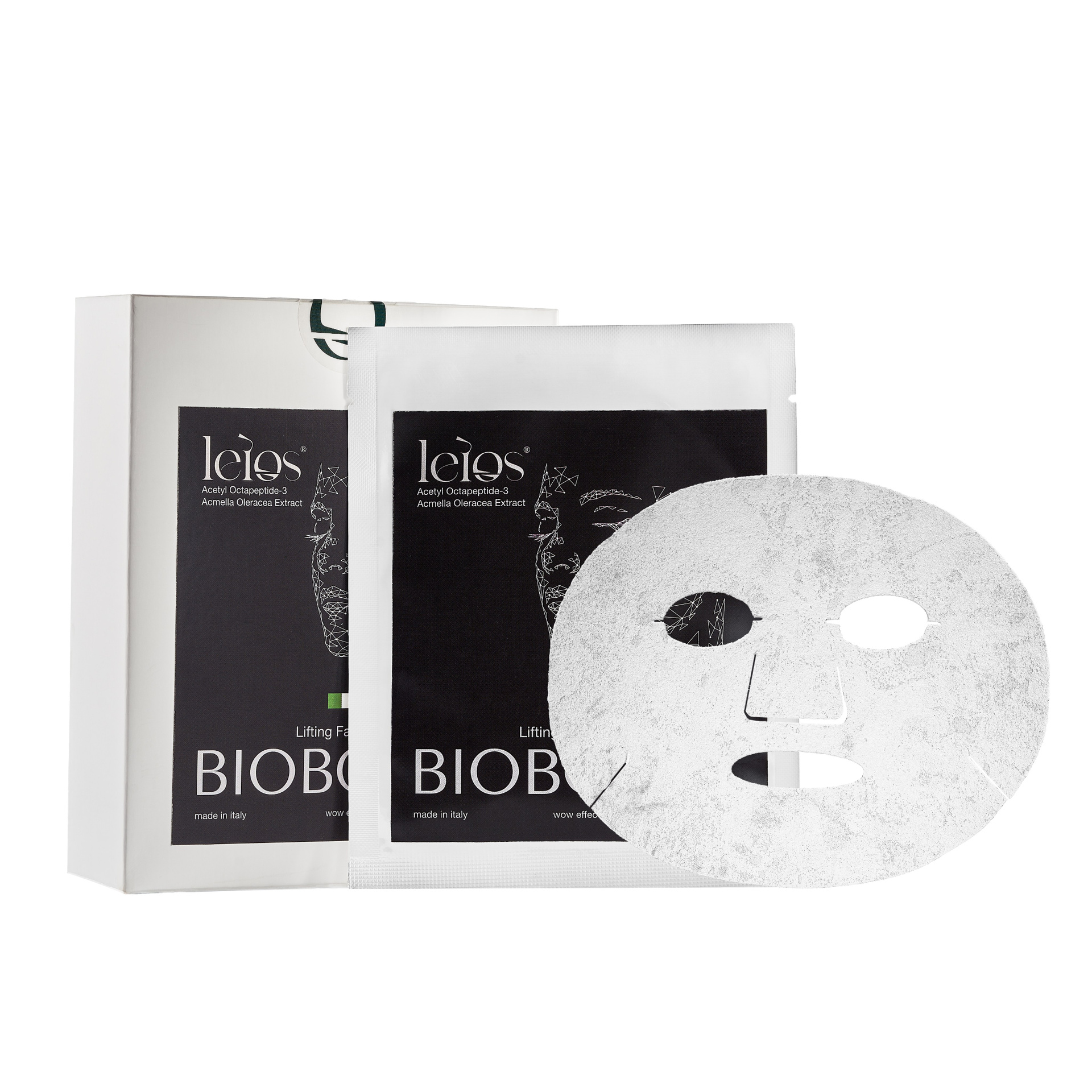
Clean listing images on white for the store and the marketplaces.
Detail shots of the packaging: the print, the seal, the material of the sachet.
Textures — product on the surface, so the consistency is visible before anyone opens the box.
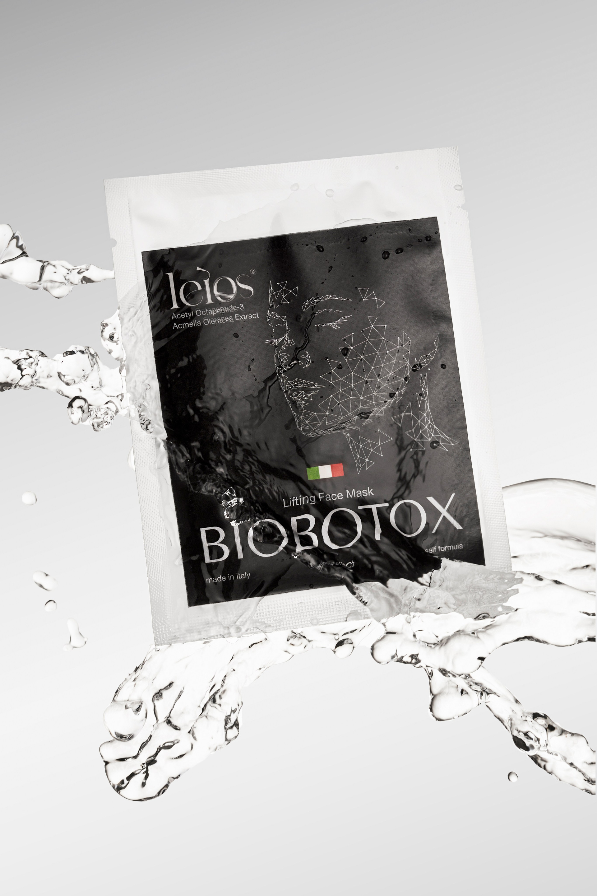
Water and movement for the campaign frames, where the product had to look alive rather than catalogued.
Flat lays of the full range, so the line reads as one collection across the feed.
What the brand got
One shoot covering the store, the marketplace listings and months of Instagram. Same light, same colour, same language across all of it — no mixing of images from different sessions.