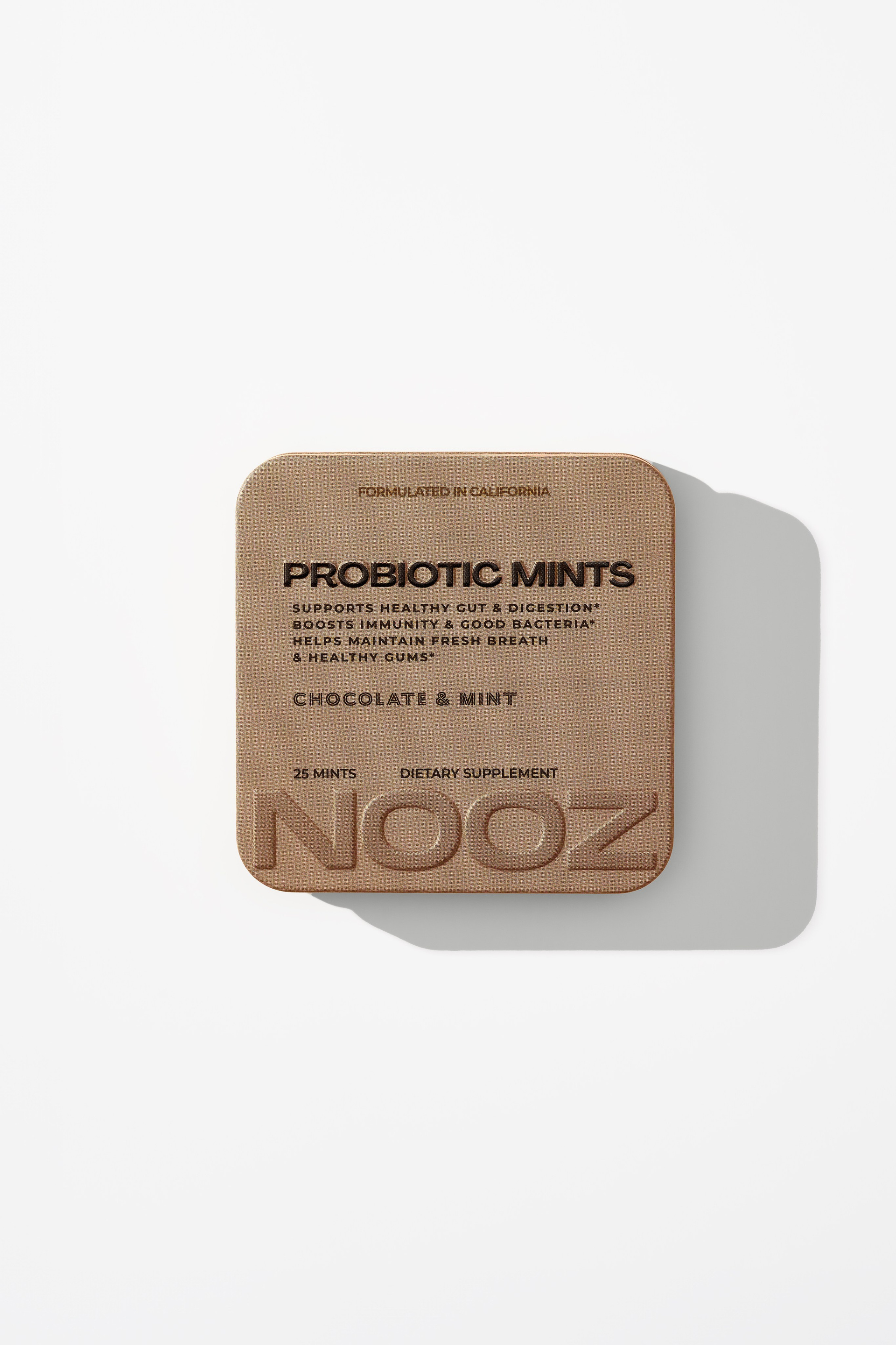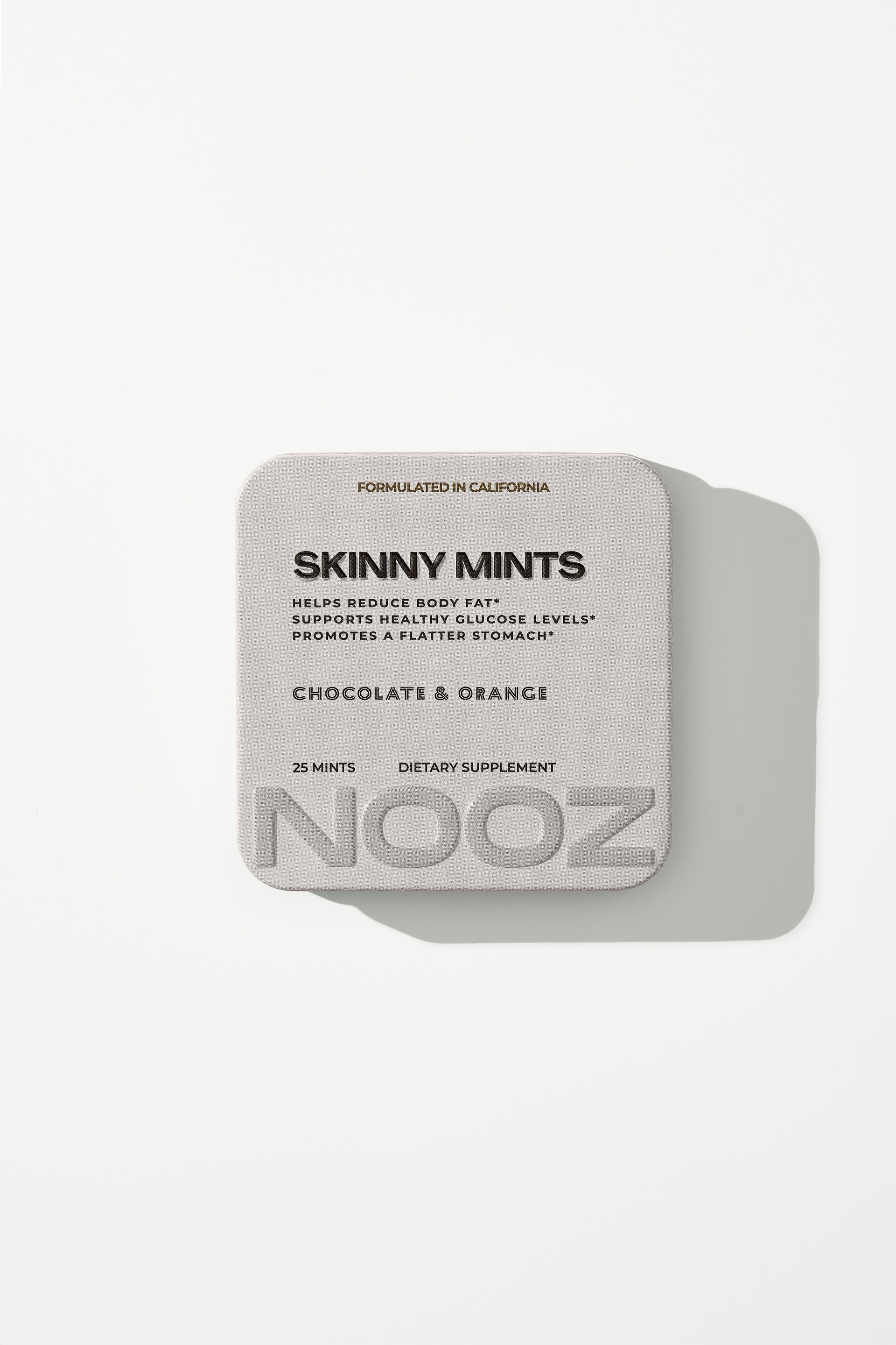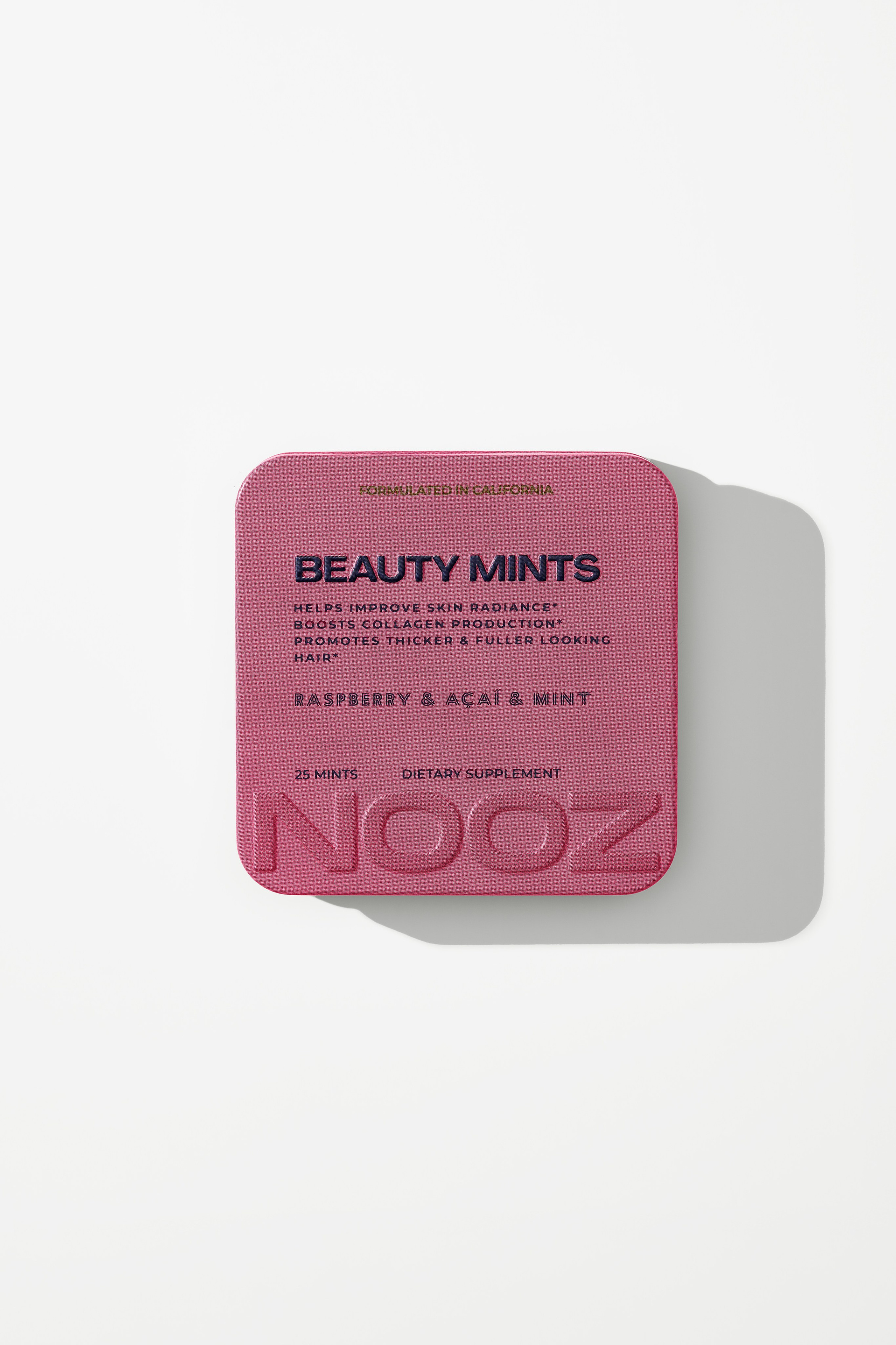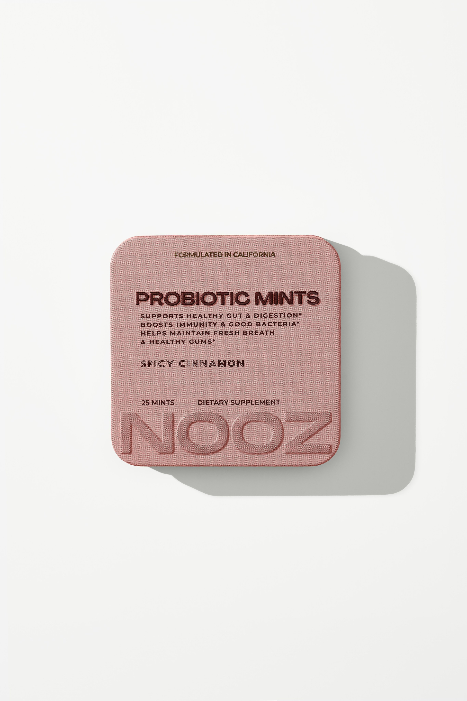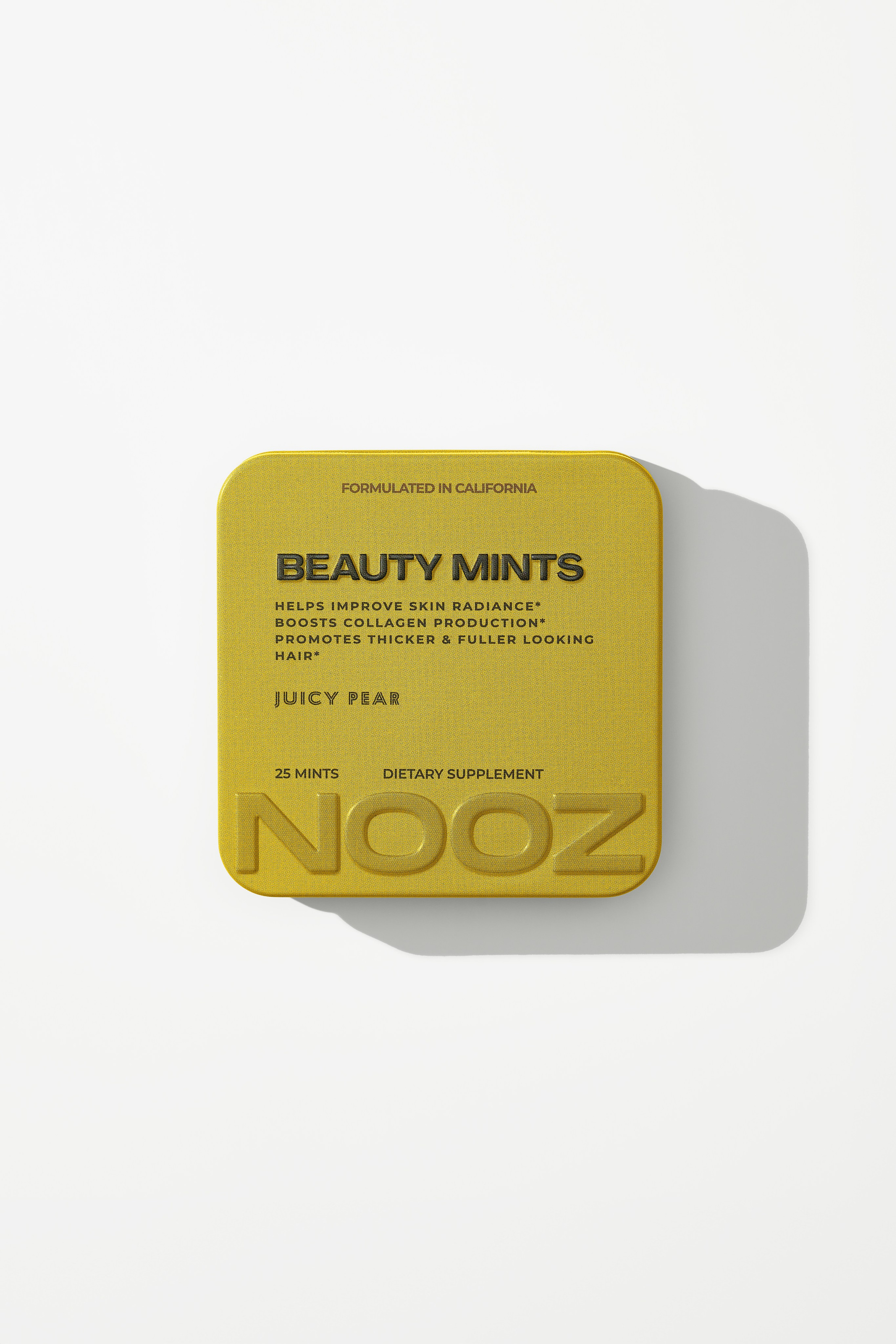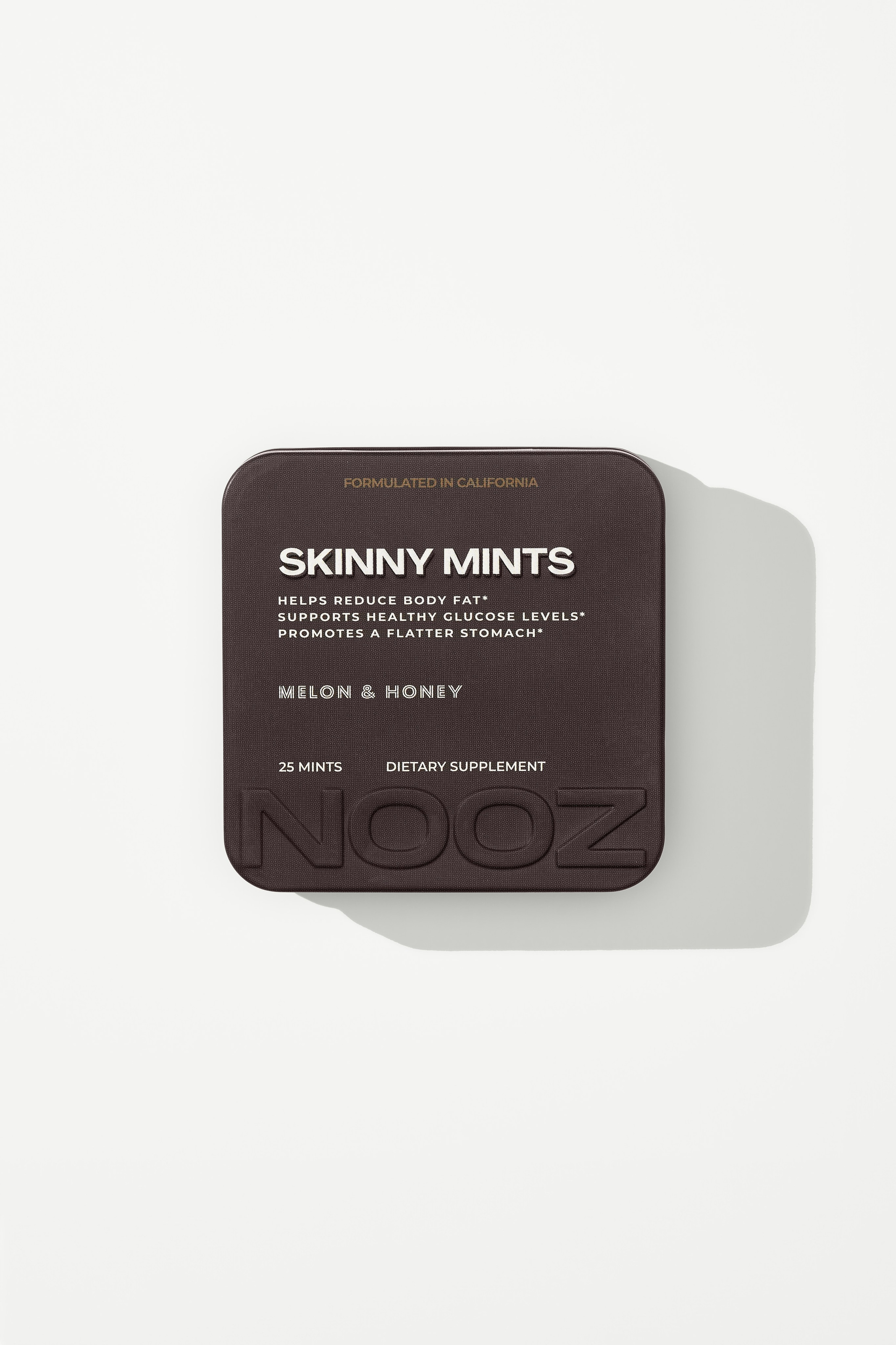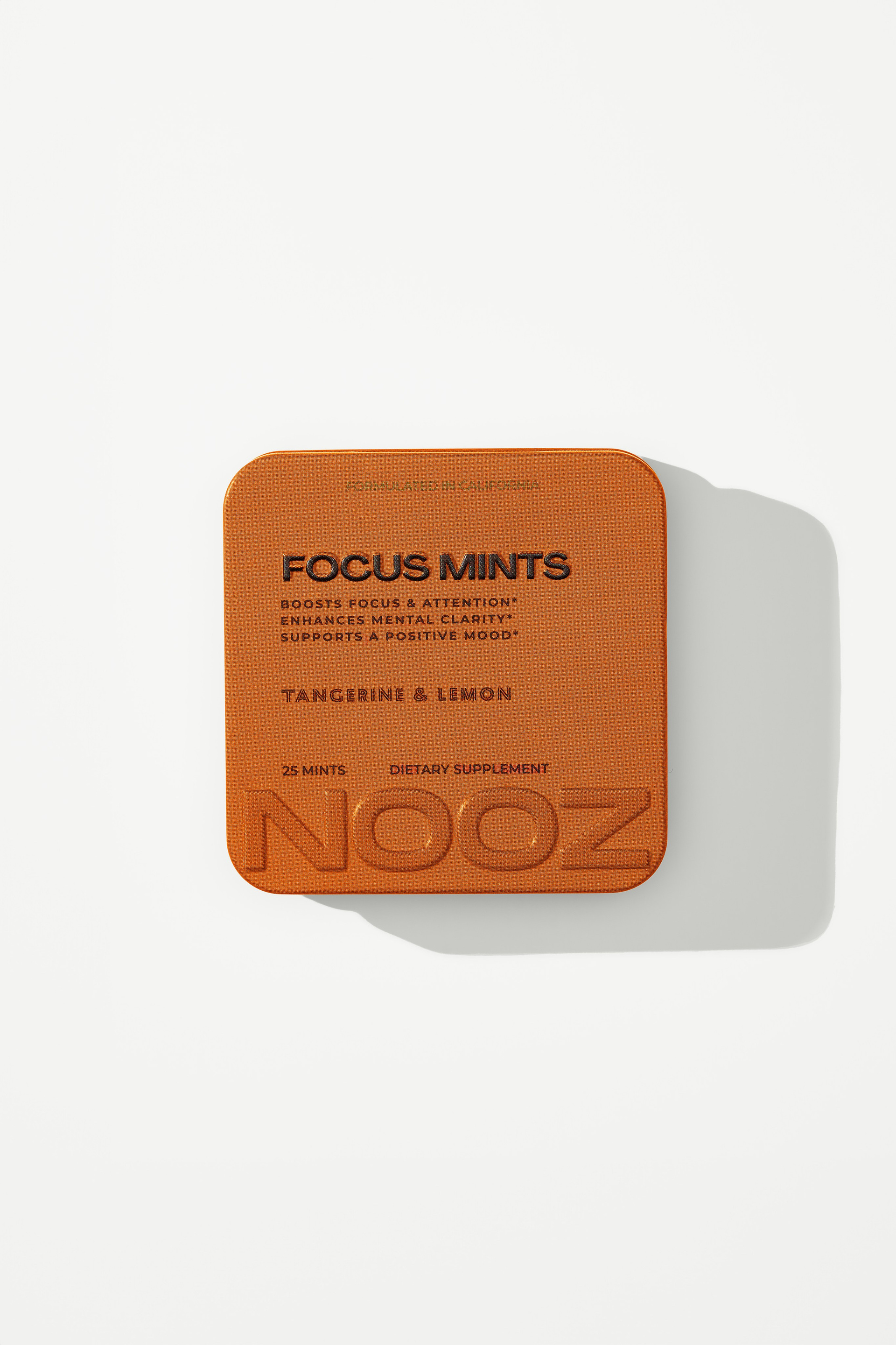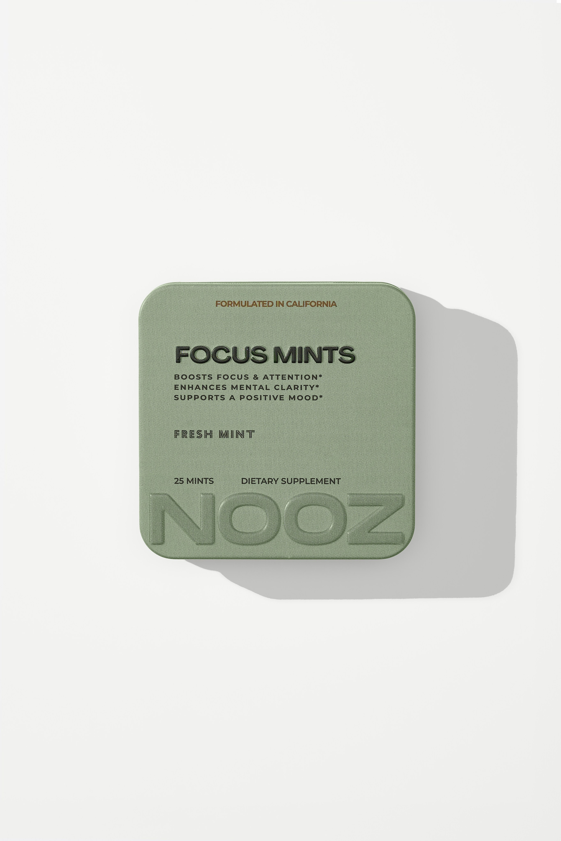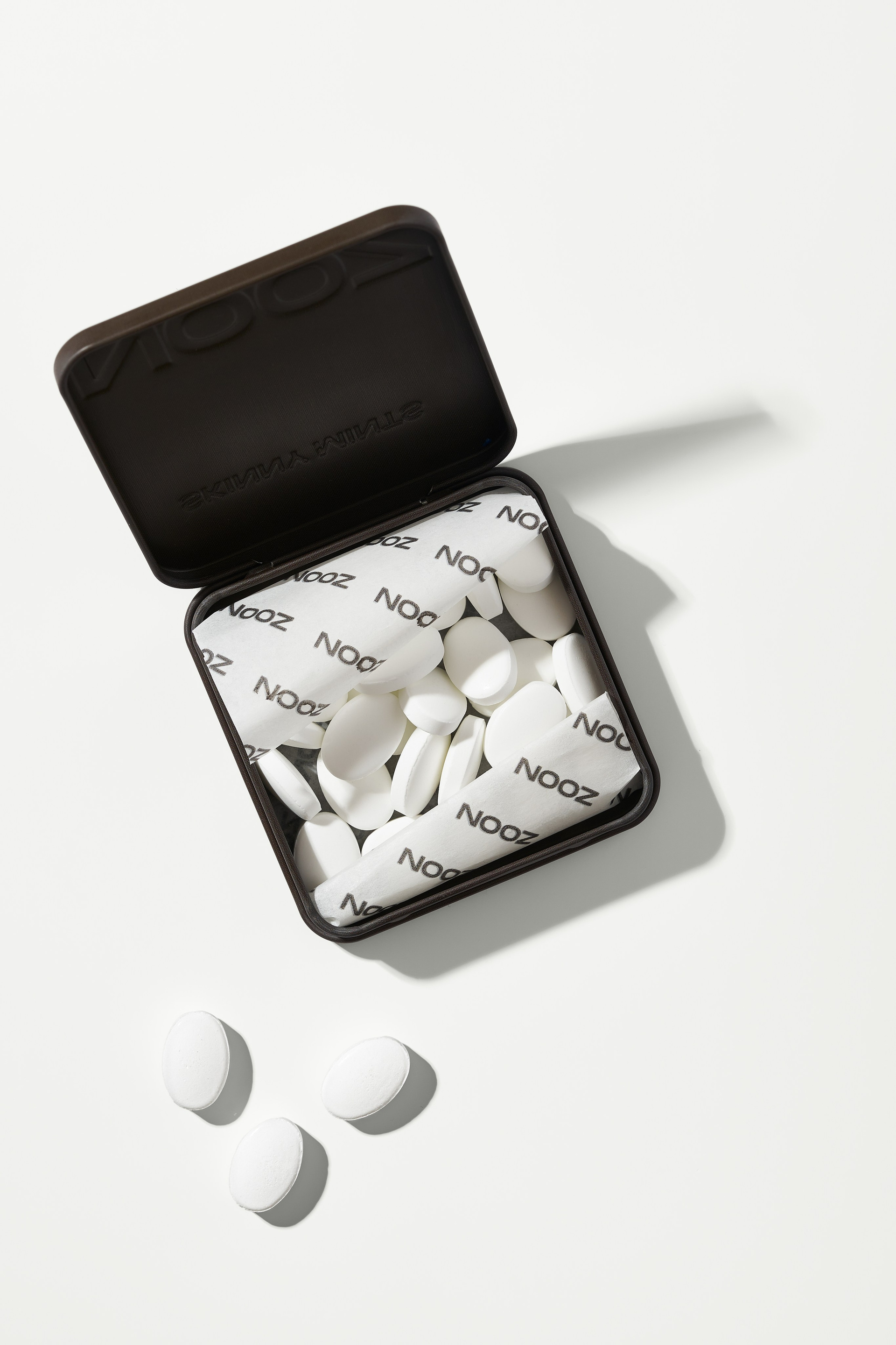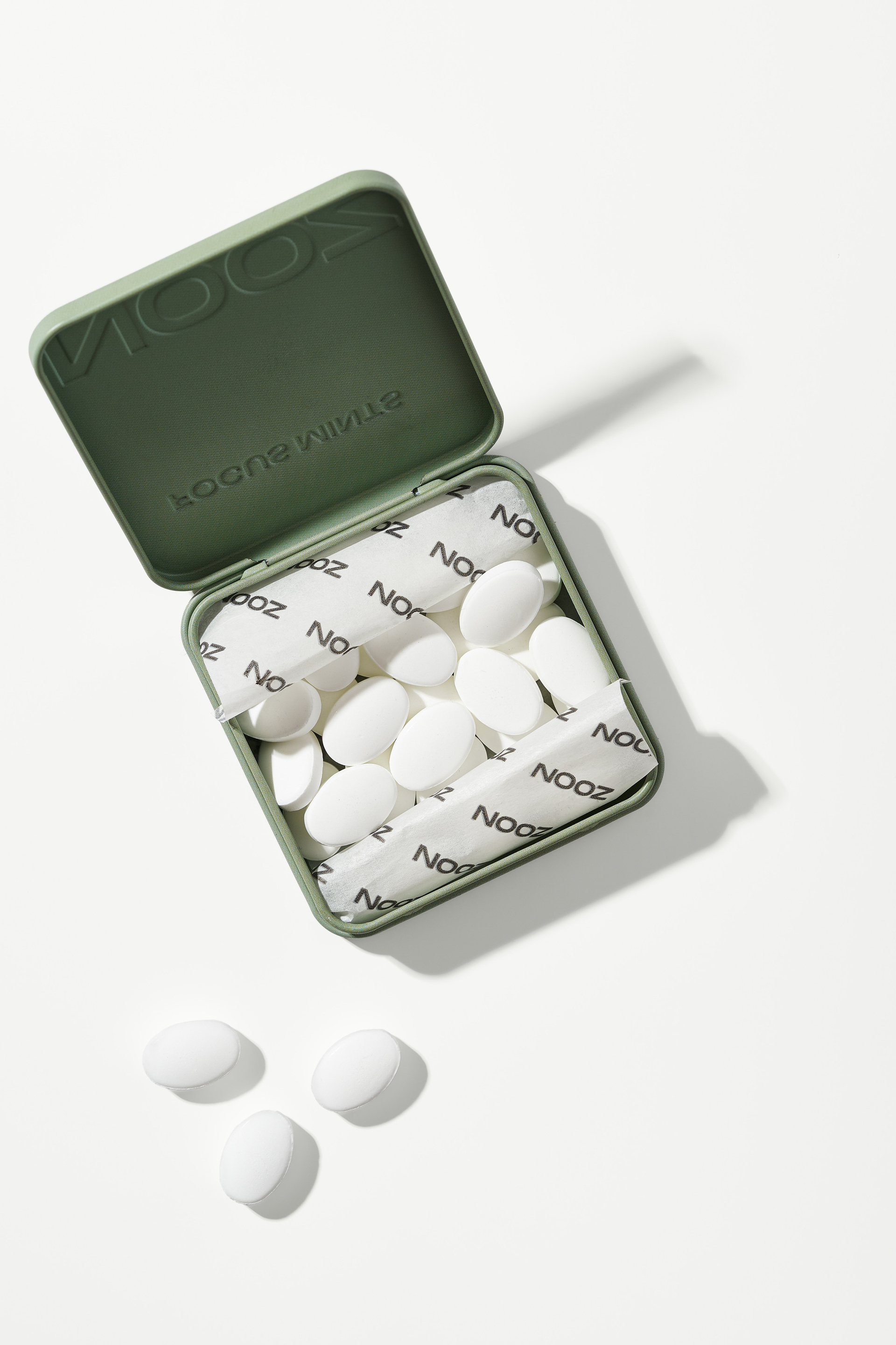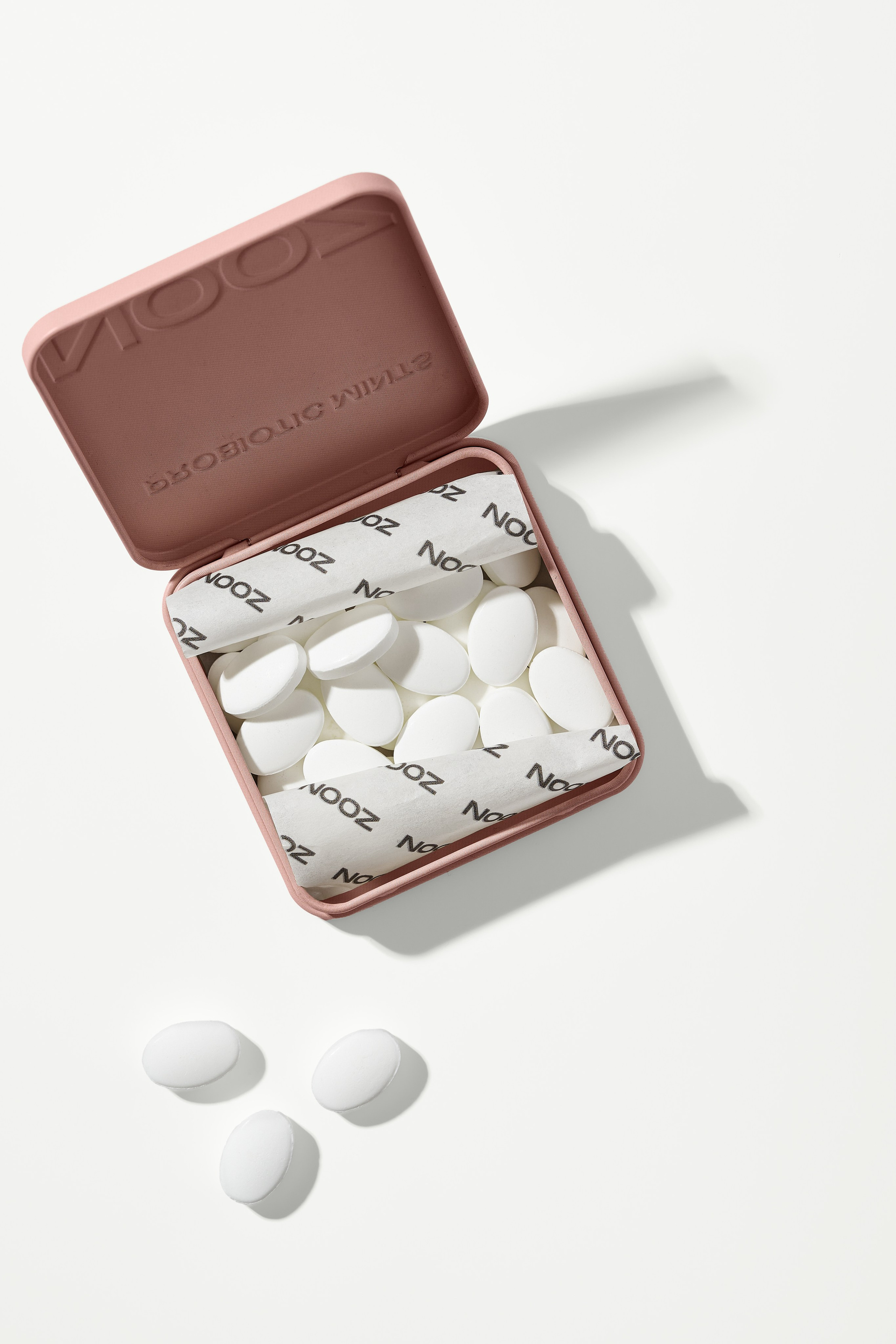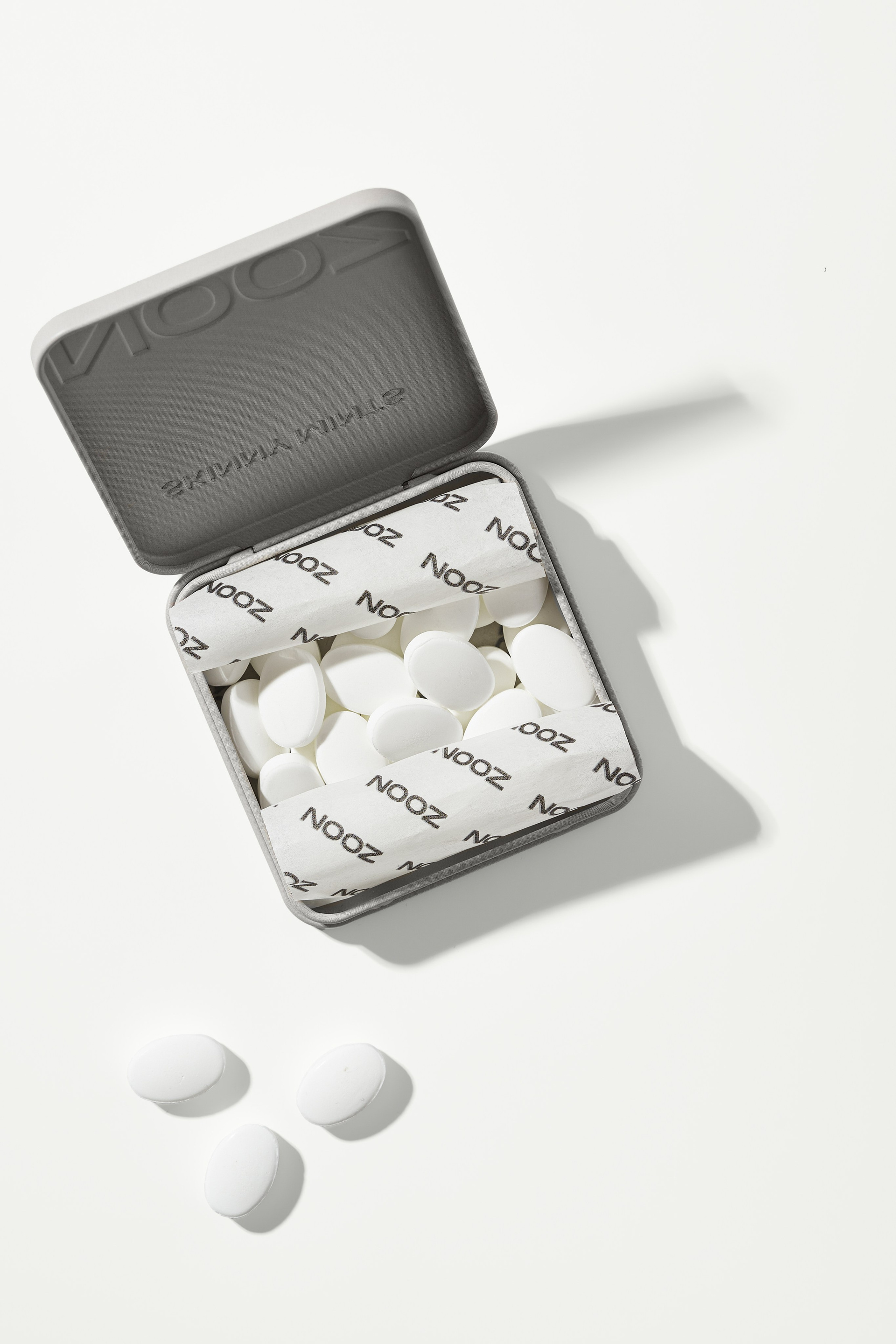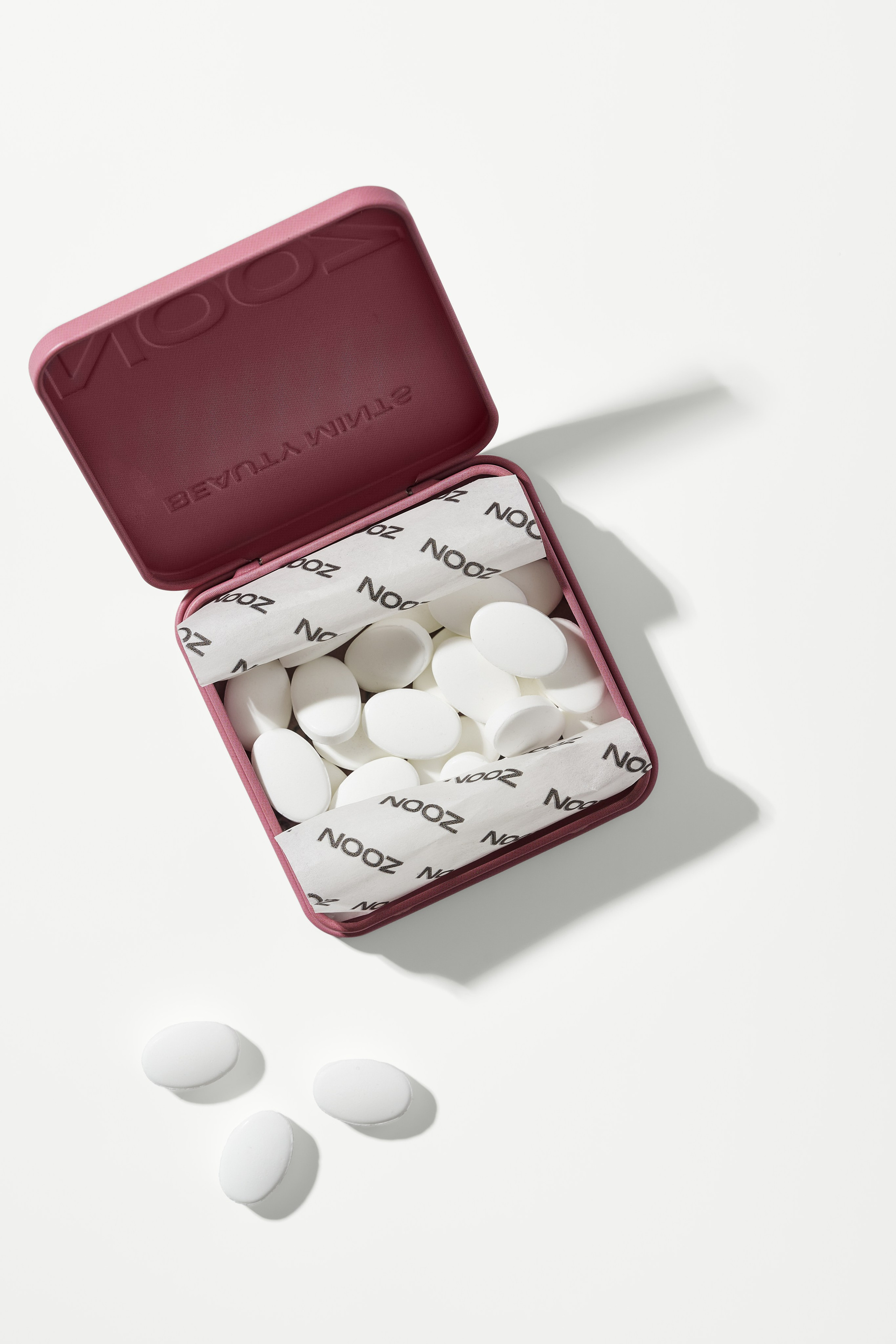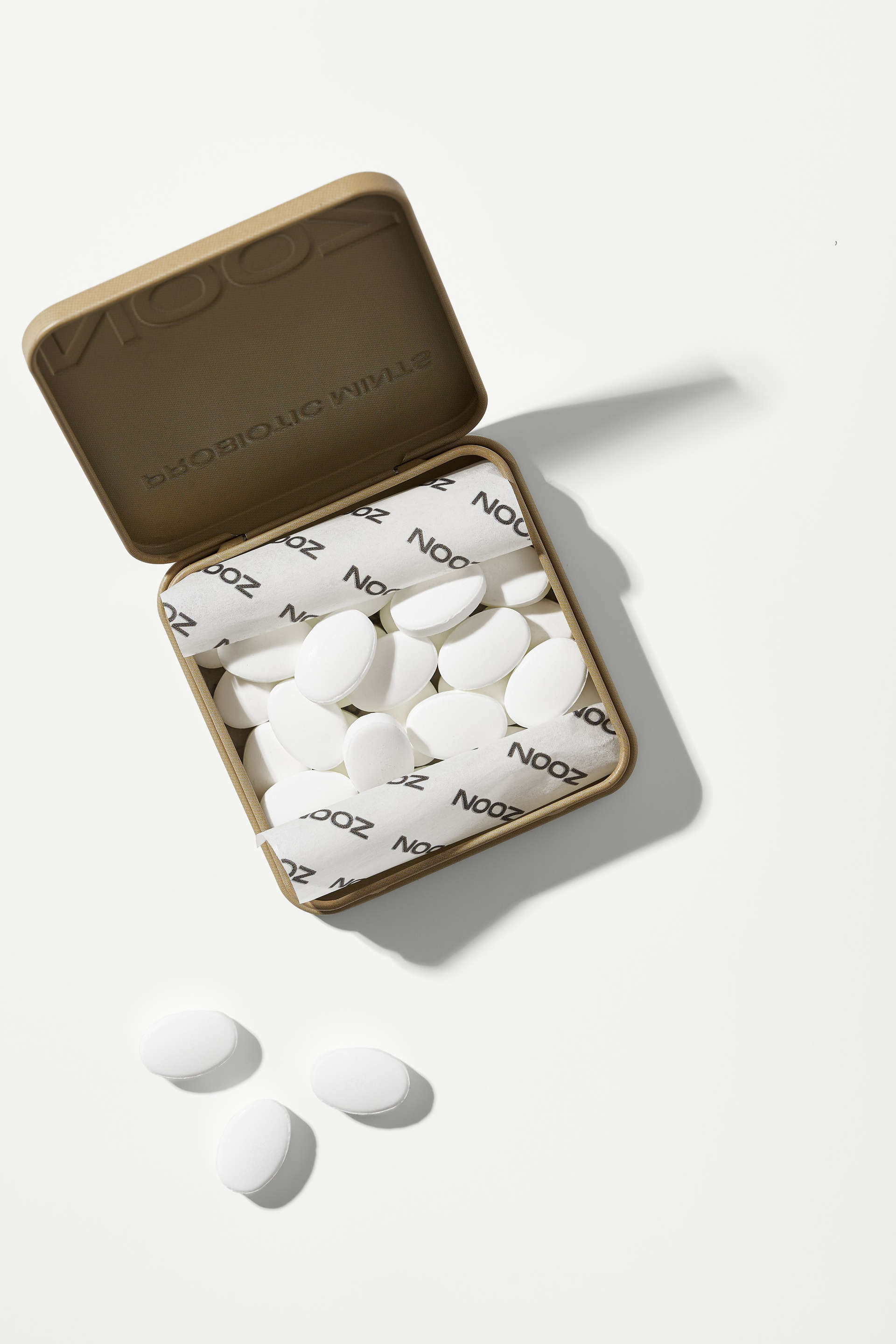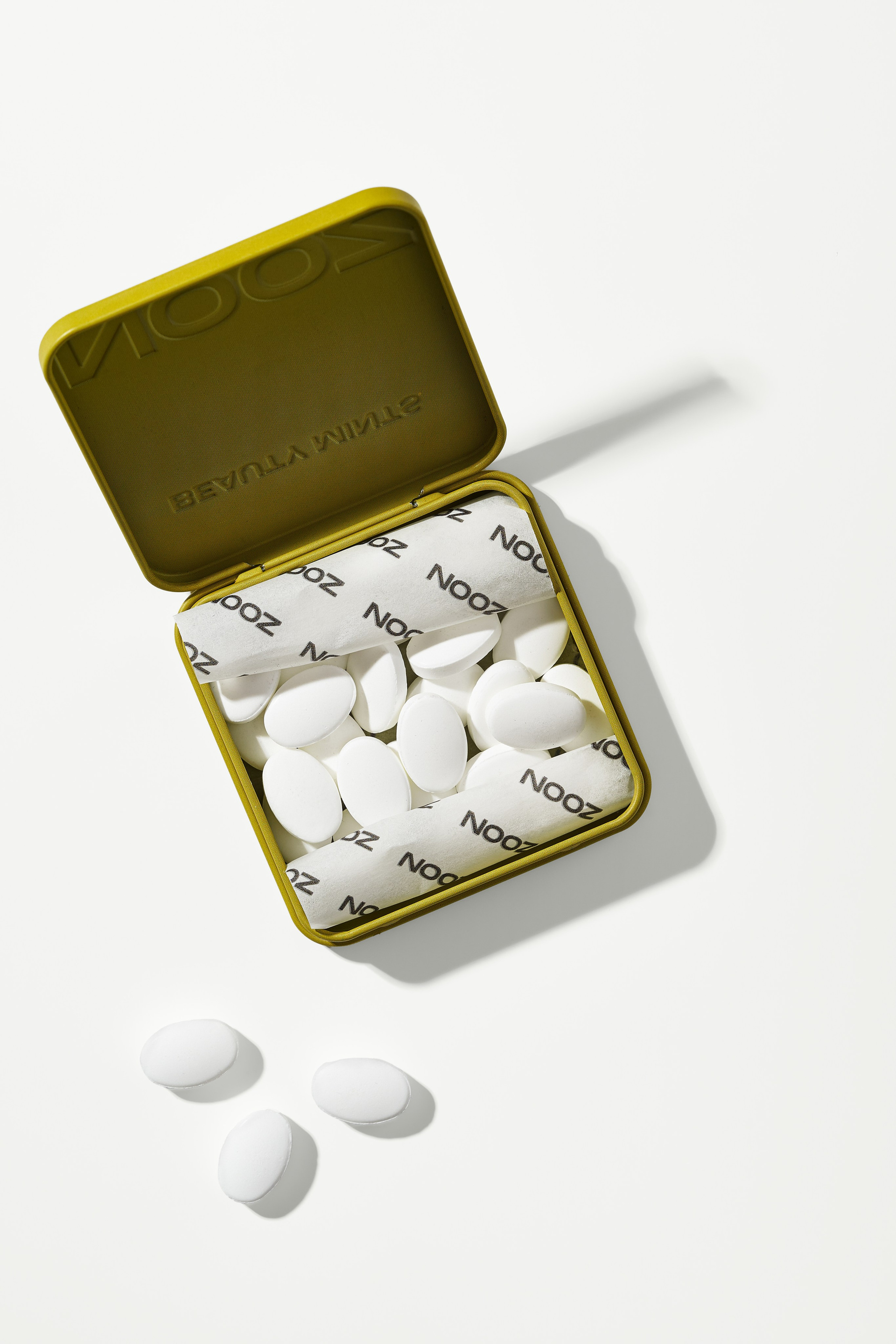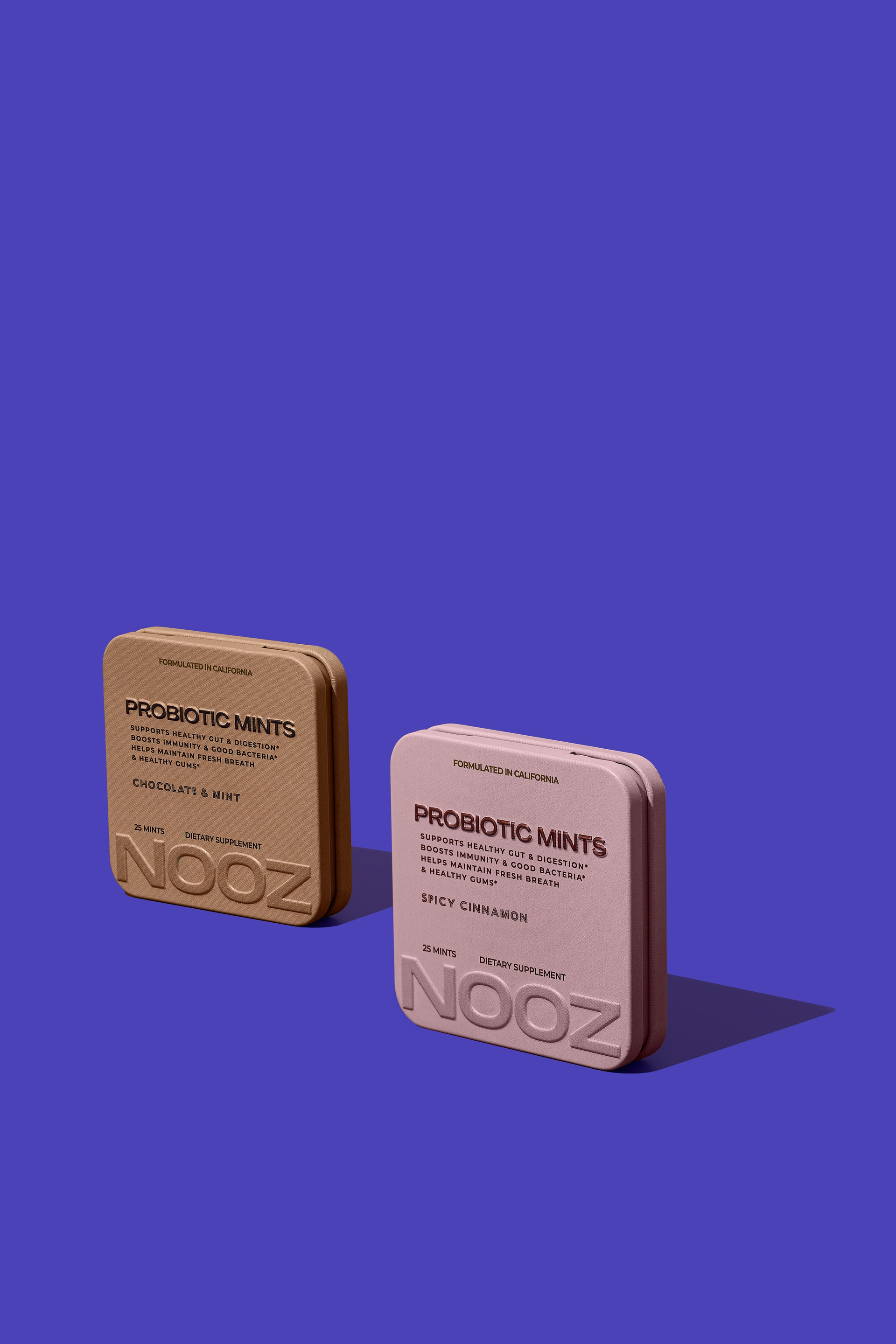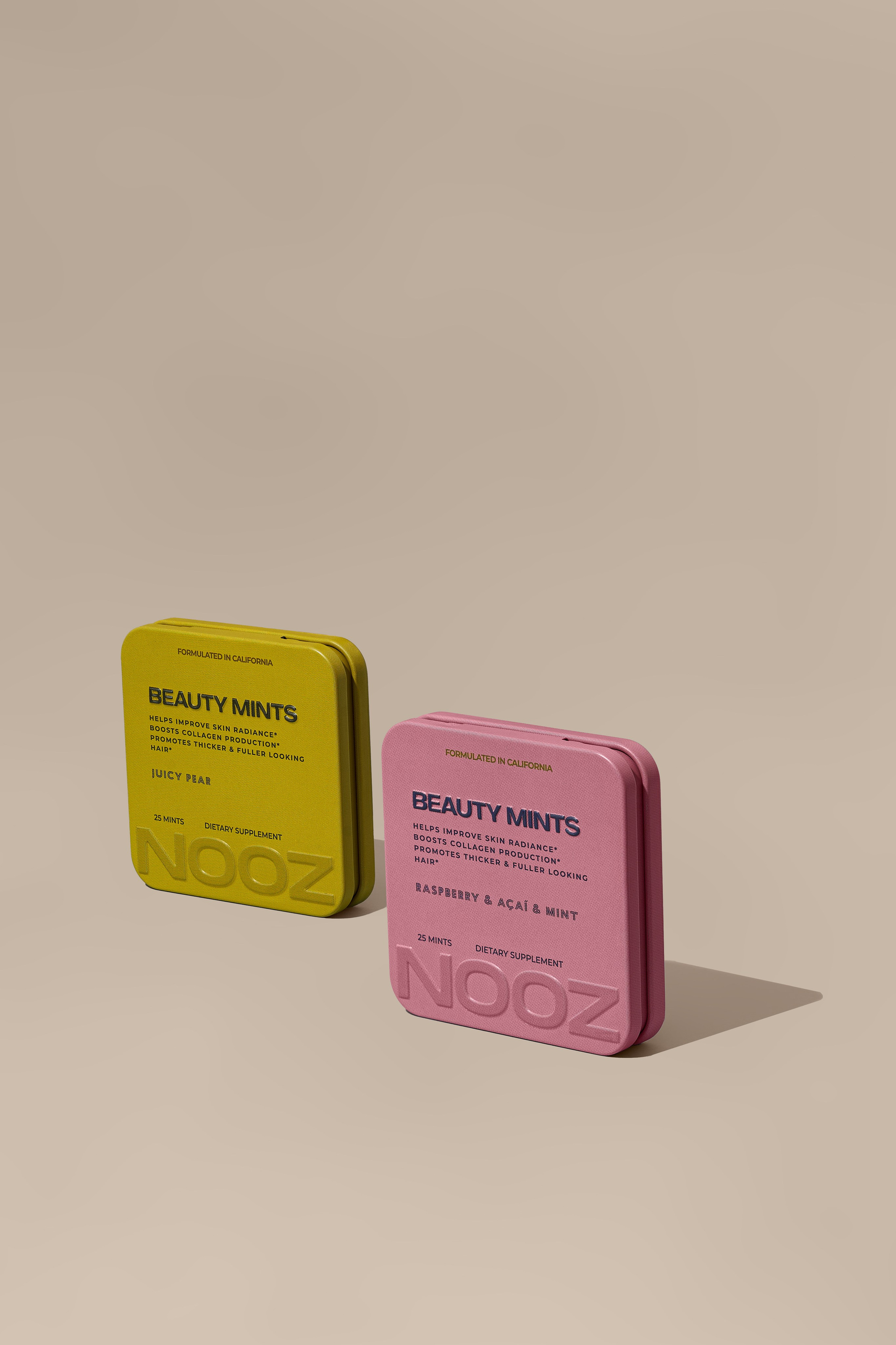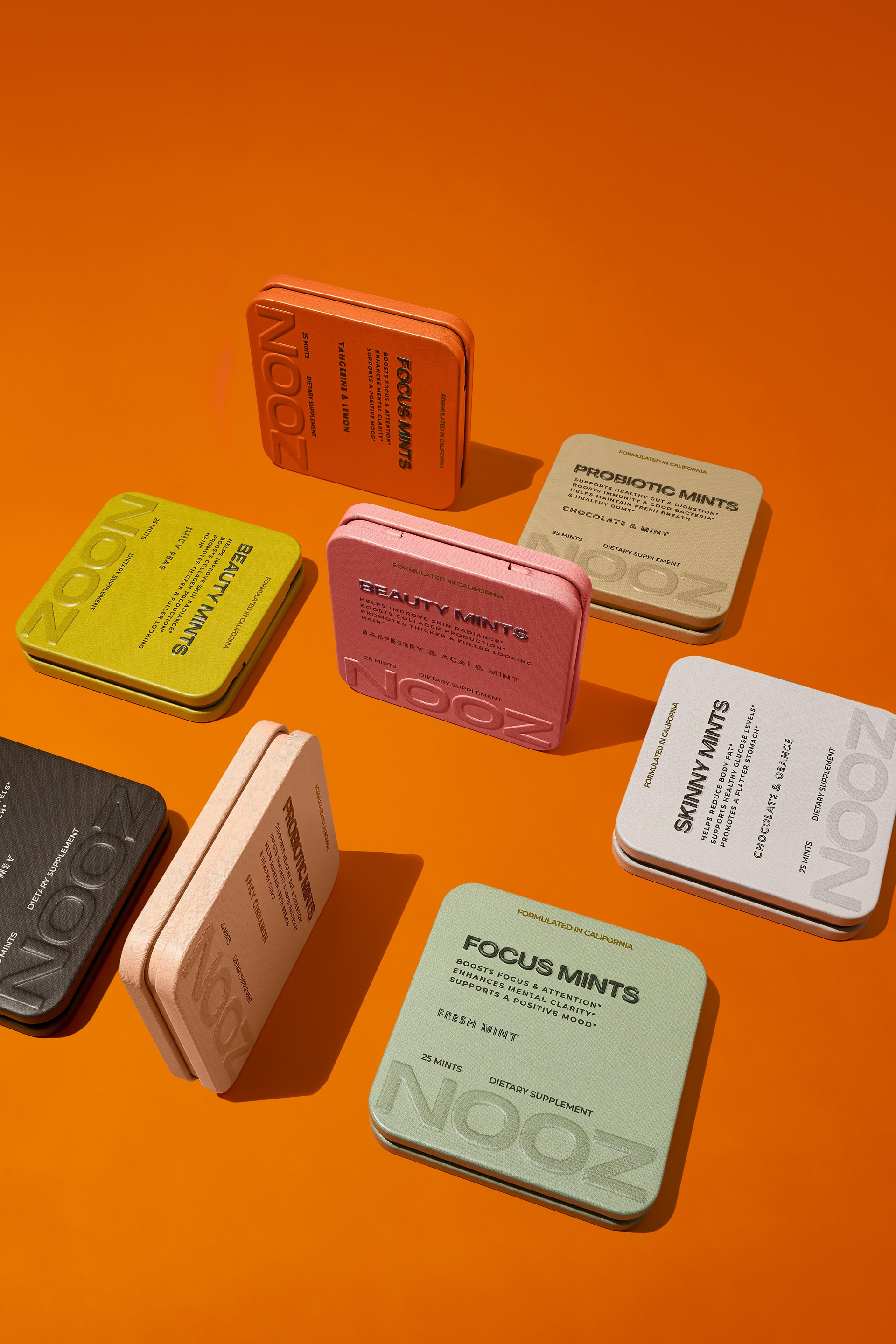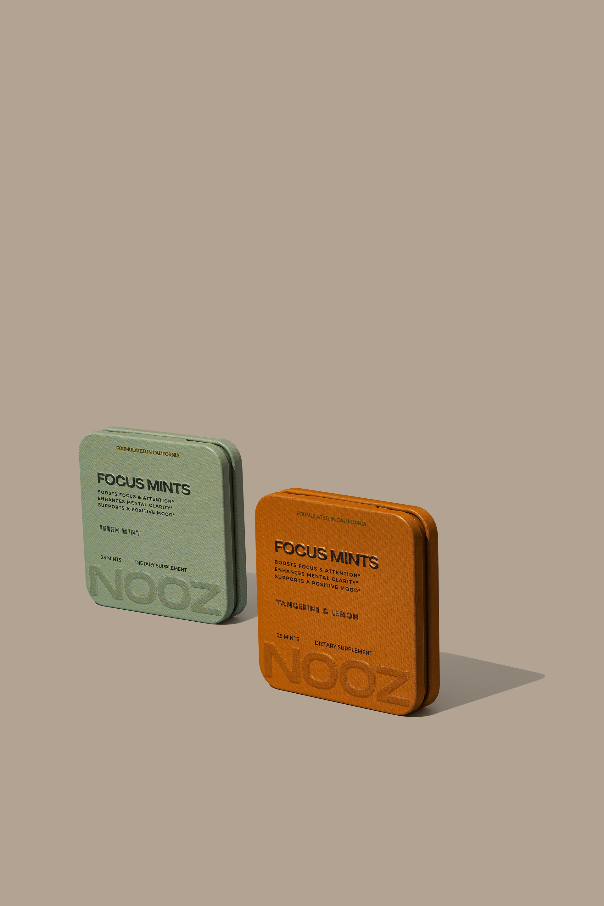

A functional mints brand was launching nine references at once. Each with its own tin colour, each with its own flavour. The problem with a range like that isn’t photographing a box — it’s making all nine sit on the same website without looking like nine different brands.
What had to be right
The colour of each tin true to the original. In a range, the customer compares the shades side by side: if one drifts, it shows next to the others.
The same framing, light and shadow across all nine, so the store grid reads as ordered.
The mints outside the tin, because that’s what gets eaten and that’s what gives a sense of the real size.
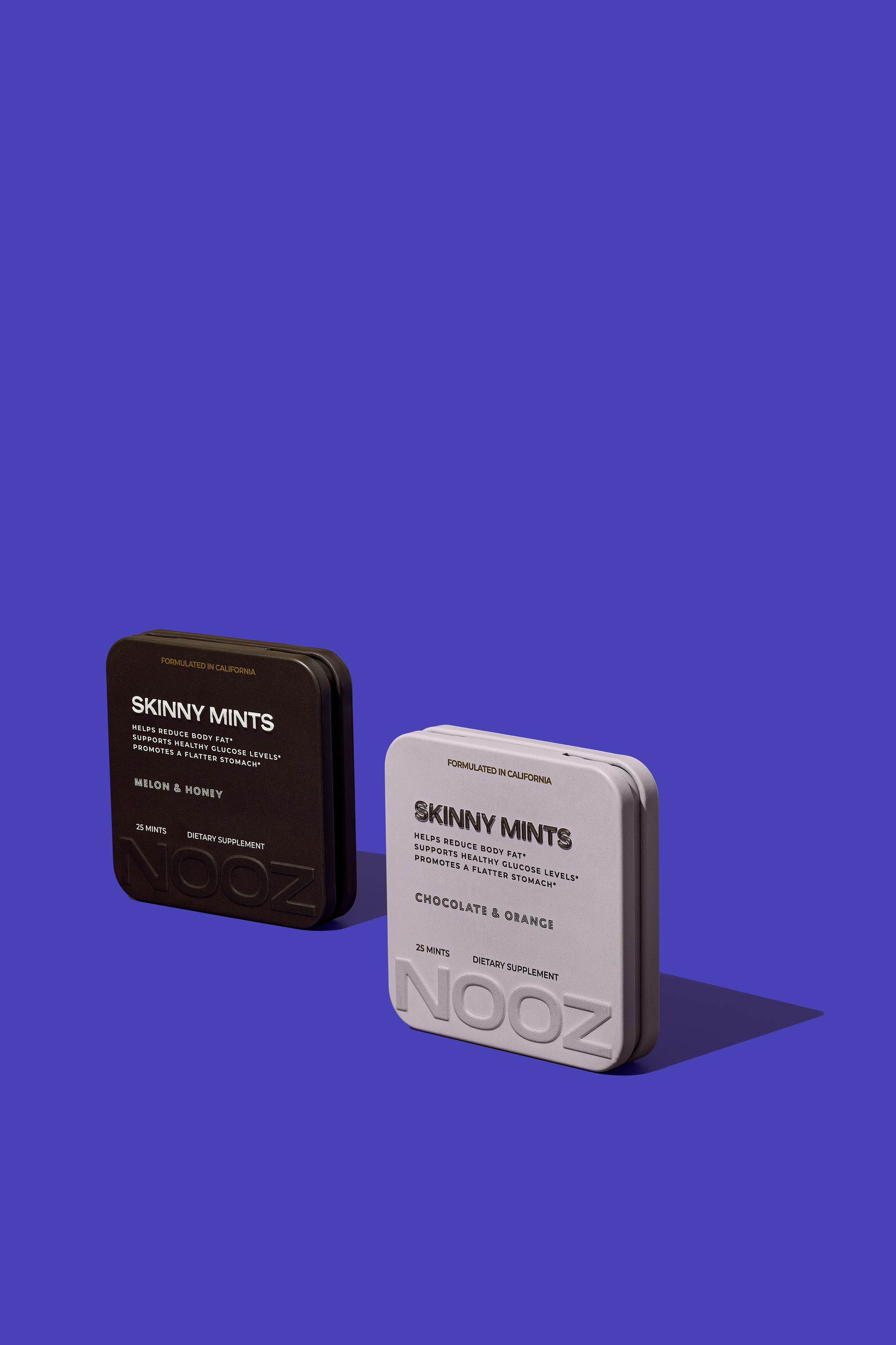
Coloured backgrounds without the product shifting hue. A beige tin on orange tends to drift, and it has to be held.
What we shot
Clean listing images of every reference, closed and open, for the store and the marketplaces.
The full range together, for the collection page and for campaign use.
Compositions on coloured backgrounds and repeated patterns for social: content that comes out of the same shoot, not a separate session.
What the brand got
An entire launch resolved in one production: listings, collection page and social material, in one visual language. Nine flavours that tell each other apart and still read as the same brand.