
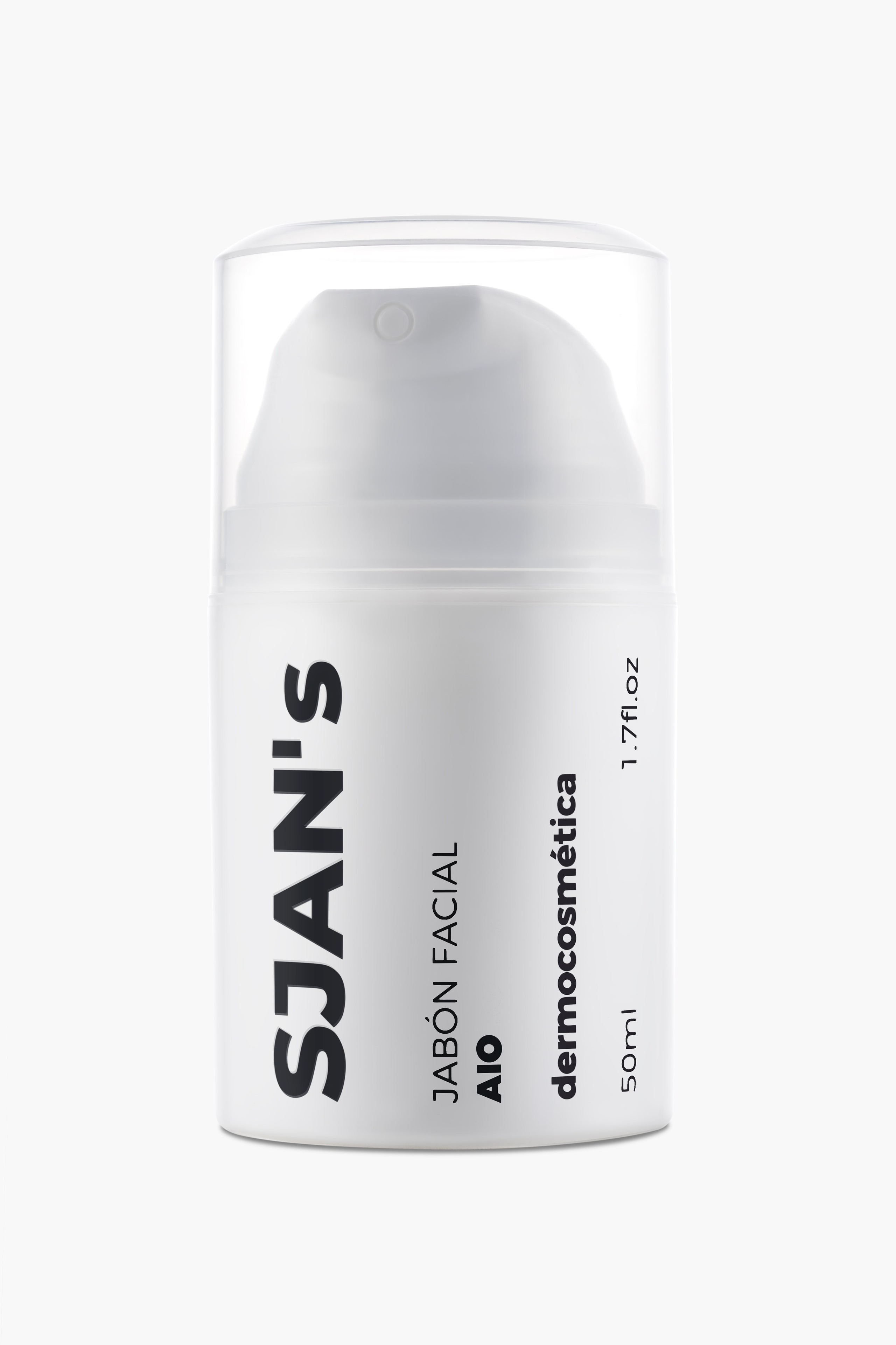
Five dermocosmetics references. Matte white bottle, clear cap, black type and nothing else.
A bottle like that looks like the easiest thing to photograph and is one of the hardest. White on white has no edge. Clear plastic reflects the whole room. And all five references are the same bottle: if one comes out half a tone off, the catalogue row breaks.
The brand didn’t need a campaign. It needed enough to open: listing, texture and a few images of the range together.
It came to twelve images. One day.
Why twelve and not fifty
The question that always comes is how many photos are needed. The honest answer is fewer than it looks, as long as they’re the right ones.
Each reference needs its clean front-on shot, and that’s five. The rest of the work doesn’t divide by product, it divides by question.
What’s the texture like. How does the range look together. How big is it.
Multiplying front-on shots answers none of those three. So the budget went to the textures and the group shots, not to adding angles of a bottle that already reads front-on.
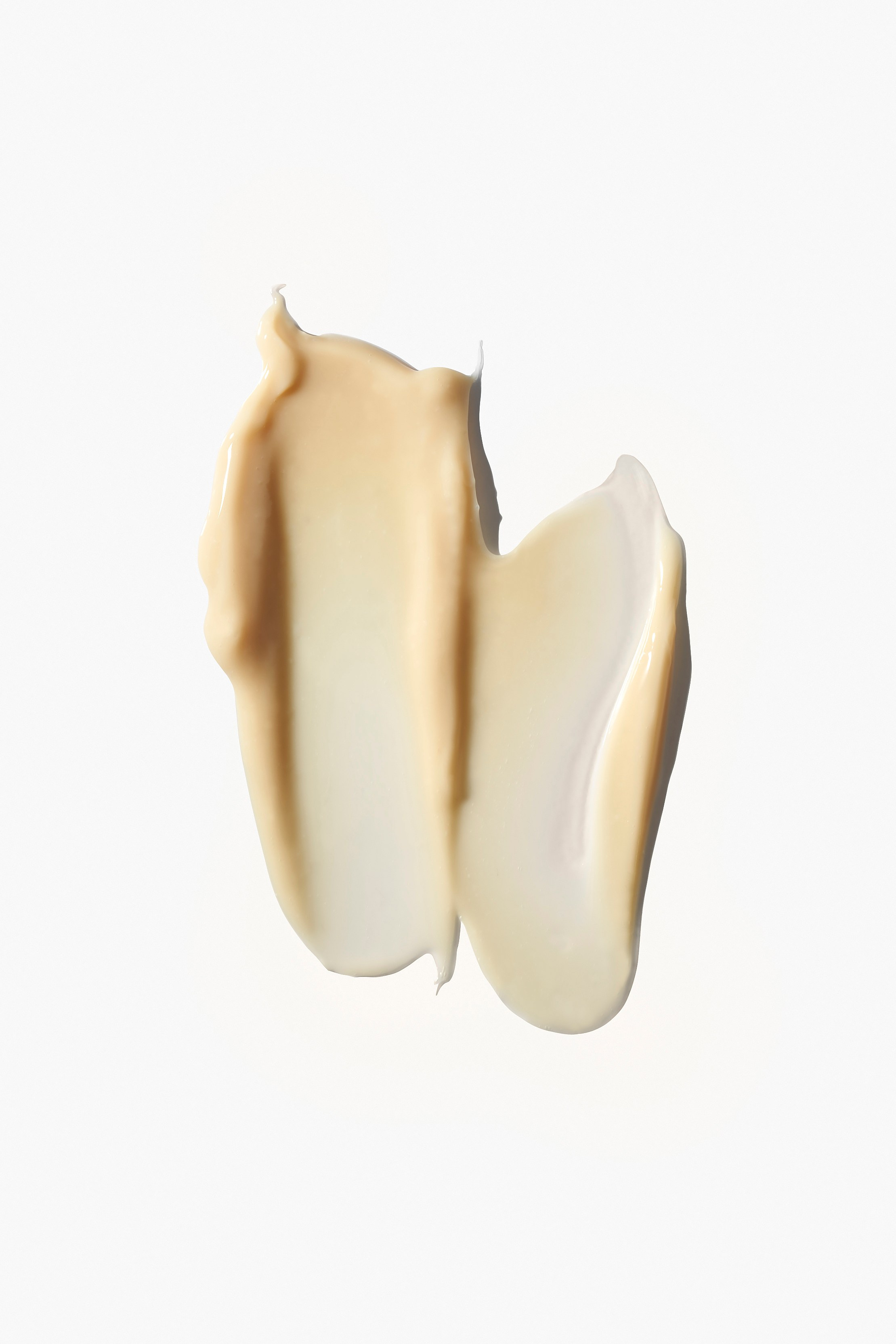
White on white, and a cap that reflects everything
A catalogue front-on has to stay neutral and has to separate from the background. Both at once.
With a matte white bottle on a light background, the silhouette disappears under flat light. What brings it back is a minimal difference between the body of the bottle and what sits behind it: enough for the eye to read the edge, not enough to dirty the white.
The cap is a separate problem. It’s clear curved plastic, so it reflects the whole room and distorts it on the way. You don’t light a cap. You decide what stands in front of it to be reflected. What you see in it was chosen.
And all five go through the same set-up, untouched. It’s the only way the catalogue row reads as one brand.
What the photos don’t show: the print was fresh
The bottles arrived with the screen printing freshly applied. The ink marked with every handling.
That changed the rhythm of the whole day.
The rule was to handle it as little as possible. Each bottle got only the handling needed to place it, without the small readjustments you normally allow yourself because they cost nothing. Here every readjustment cost a fresh mark.
What was left got cleaned afterwards in retouching.
We’re telling it because it’s the part of the craft that never shows in the final image, and it decides whether the catalogue comes out whole or comes out with two references worse than the other three.


Texture wants a different light from the bottle
This is where most beauty shoots break: trying to solve the product and the texture with one scheme.
It can’t be done. A bottle wants broad, controlled light. A texture wants low light, almost grazing the surface.
It’s what the sun does late in the day: overhead, the ground looks smooth; from the side, every grain appears. A cream under flat light looks like a silicone pastille. Under raking light the edge appears, the cream folds over itself, traps a shadow, and then it reads as cream.
This line had four different consistencies and each behaves its own way:
The emulsion has body: it holds its shape, and the relief shows up just by dropping the light.
The cleansing gel foams with bubbles of very different sizes. Bubbles are transparent spheres and each returns its own reflection, so what draws them isn’t how much light there is but where it comes from.
The biphase serum is the opposite of all of that. It’s clear, and clear on a light background doesn’t exist: it reads as dirty water. The volume comes from the low light, which draws its edge and lifts it off the white. And it has to go fast: a drop of serum spreads on its own, so framing and light are settled before anything is dispensed, and the frame comes after. Stop to adjust and it isn’t a drop any more, it’s a puddle.
The oil falls in drops with a clean edge, and there the work is keeping that edge from dissolving into the white.
The group shots, which are another session inside the same one
Range images aren’t five front-on shots placed side by side.
In the group shot the five references stand apart, with long hard shadows running to one side. That isn’t catalogue any more: a hard shadow has a direction and a time of day, and it turns a row of bottles into a scene.
The brand had sent visual references with the brief. They weren’t copied: they were there to agree on the tone before anything was switched on, which is what a mood board is for.
It’s the image that works for the site header and for social, where a front-on on white doesn’t hold up.
The full range of textures was also shot together, and that’s the image that explains the most: four consistencies in one frame, and at a glance it reads as a line rather than five separate products.
What wasn’t done
Worth saying, because twelve images aren’t the answer to everything.
No product on skin. The gesture of applying it, the cream absorbing, the hand. That calls for a model, and with it casting, make-up and image rights. Opening didn’t need it.
No video. Texture in motion is what works best in Reels and in the listing loop, and it’s a separate layer.
No still life with ingredients. It tells the formula without words, but it’s art direction and a built set, not a product day.
No scale in hand. A 50 ml bottle shot large arrives home smaller than the customer expected. It’s a cheap shot to add and it heads off silly returns.
For a line that already sells and wants to grow, those four are the next step. For getting the shop standing up, they aren’t.
What’s left
The brief was for the brand’s website: product listings and the header images.
Twelve files, five references, ten working days. A catalogue set-up that can be rebuilt identically when the line grows, so reference six matches the first one.
Launching a cosmetics line?
Tell us how many references, which finishes and when you need them.