

1 · What works as a reference, and what doesn’t
A reference is something you can put next to the product and compare.
These work well: a physical sample of the product or the fabric, a brand colour code in whatever system you use (Pantone, HEX, CMYK), or an approved image of yours that you want to match.
These work badly, however clear they sound: “white like the one on our website”, “our usual green”, “the same tone as last season”. Not because they’re incomprehensible, but because they describe a memory, and a memory can’t be measured against the product sitting on the table.
If you have both a code and a sample, send both: the code says what to aim for, the sample says what’s achievable.
2 · The material decides how close you can get
Some colours reproduce almost exactly and others don’t, and that depends on the material before it depends on the camera.
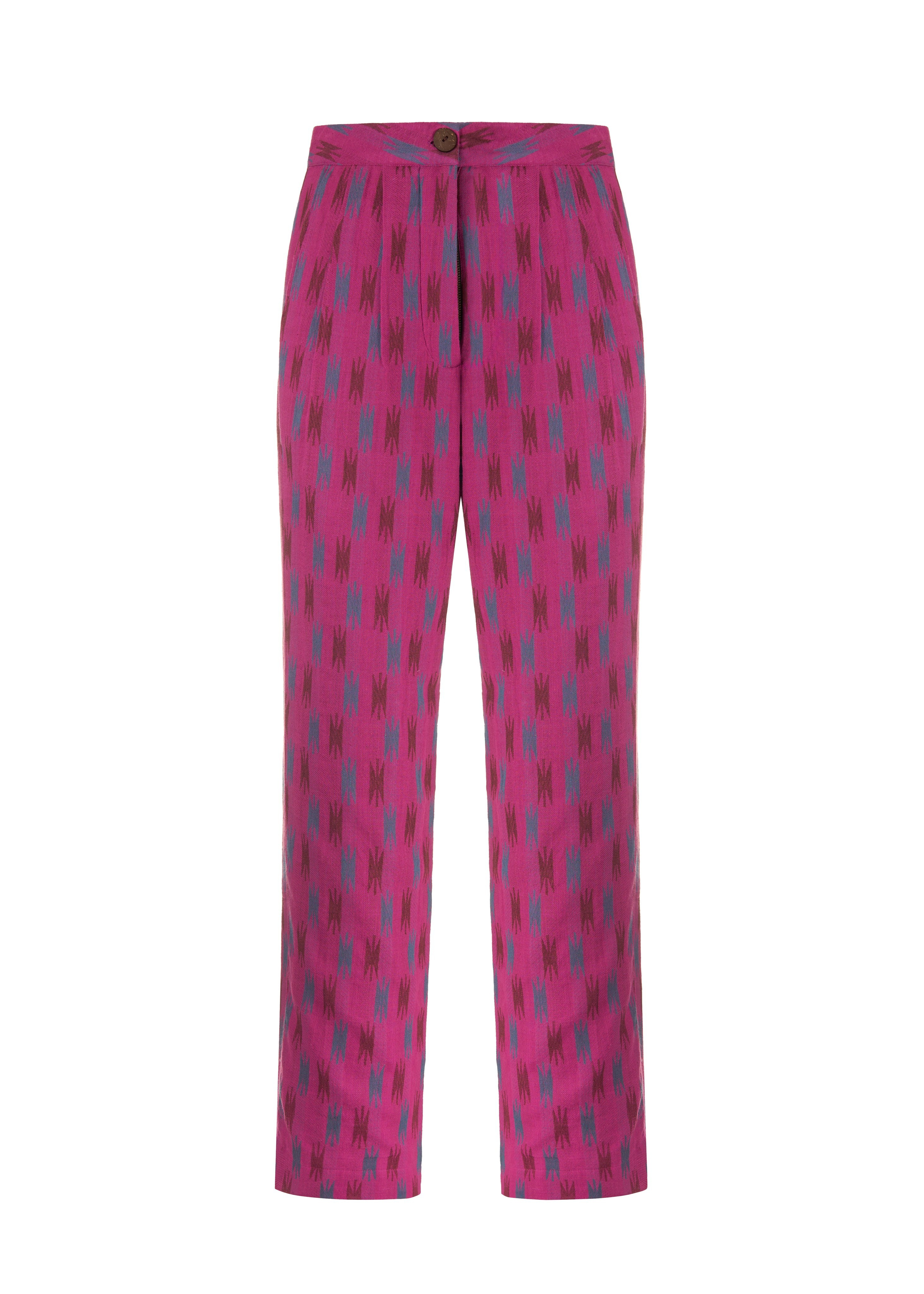
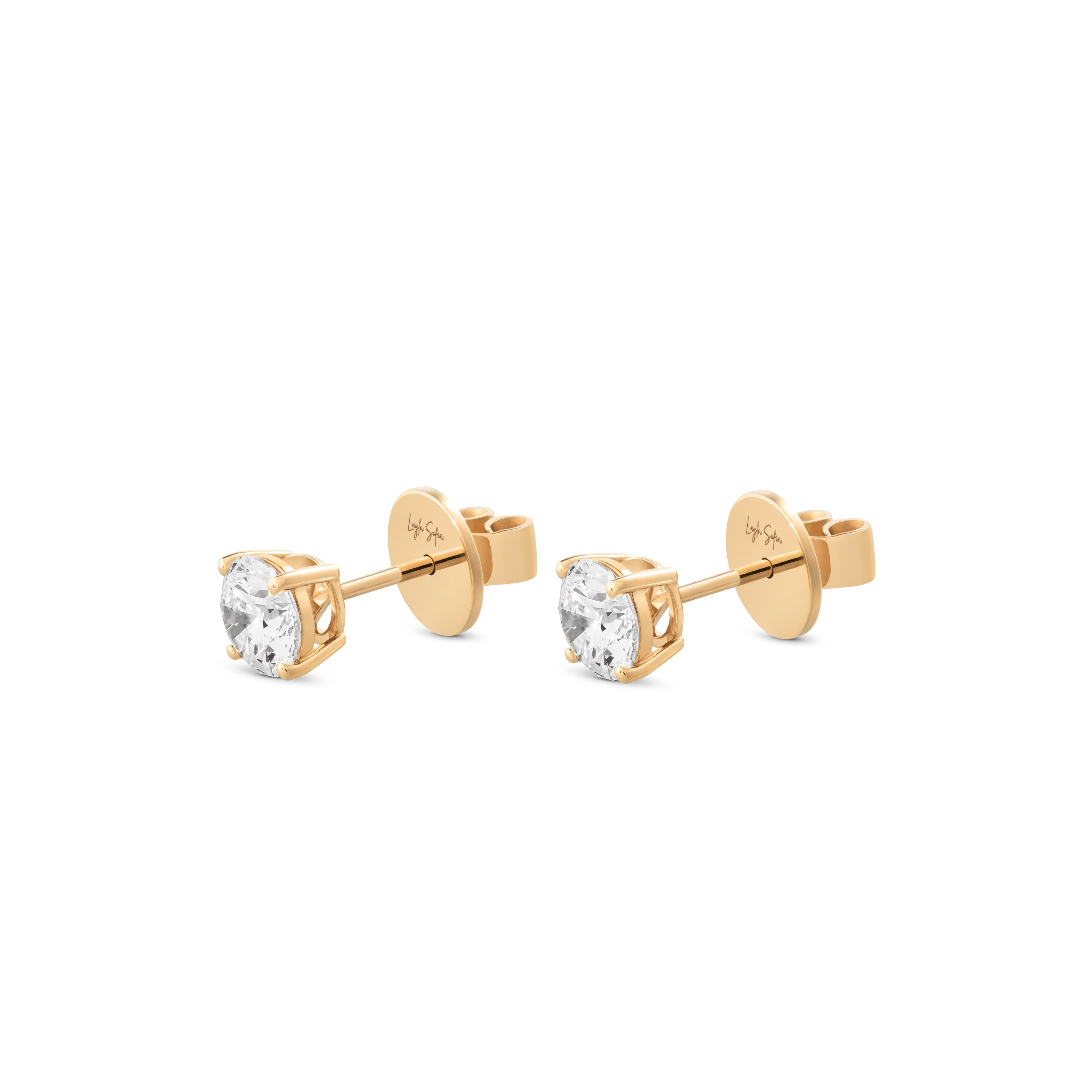
Matte, opaque finishes are the most stable. Glossy and metallic surfaces change with whatever they reflect: a gold reads differently with a light wall in front of it than with a dark one, because much of what you see is the surroundings, not the metal. Fabrics change with the direction of the weave: the same cloth looks like two different tones turned ninety degrees. Translucent things — a bottle, a resin, a gel — depend on what sits behind them.
None of this prevents a faithful colour. It only means that in those cases colour is a lighting decision, not a later adjustment.
3 · Some colours change depending on the light you view them under
This is the one that confuses people most, and it has a name: two tones that match under one light stop matching under another.
It happens daily with textiles and paints: the grey of the t-shirt and the grey of the trousers are the same in the shop and different at home. On a product page, the effect shows up when the photo is seen next to the real garment under the client’s living-room lamp.
So in the studio colour is decided under stable light and checked against the sample in that same light. And that’s why a perfect match under every lighting condition in the world doesn’t exist — what does exist is an image that’s correct and consistent with the rest of your catalogue.
4 · The screen you look at is part of the result
A correct image can still look wrong along the way.
Phone screens shift the tone according to the ambient light and, with night mode on, warm it deliberately. A laptop shows different colours depending on the angle of the lid. And a room with yellow light makes you judge something cold that isn’t.
No special equipment is needed to review: look in a room with neutral light, with night mode off, and on more than one screen if you can. If someone on your team approves colour, it helps if they do it on the same screen each time.
5 · Colour is approved on an image, not on a description
It’s the same rule we already apply to the level of retouching, for the same reason: words about colour aren’t comparable between two people.
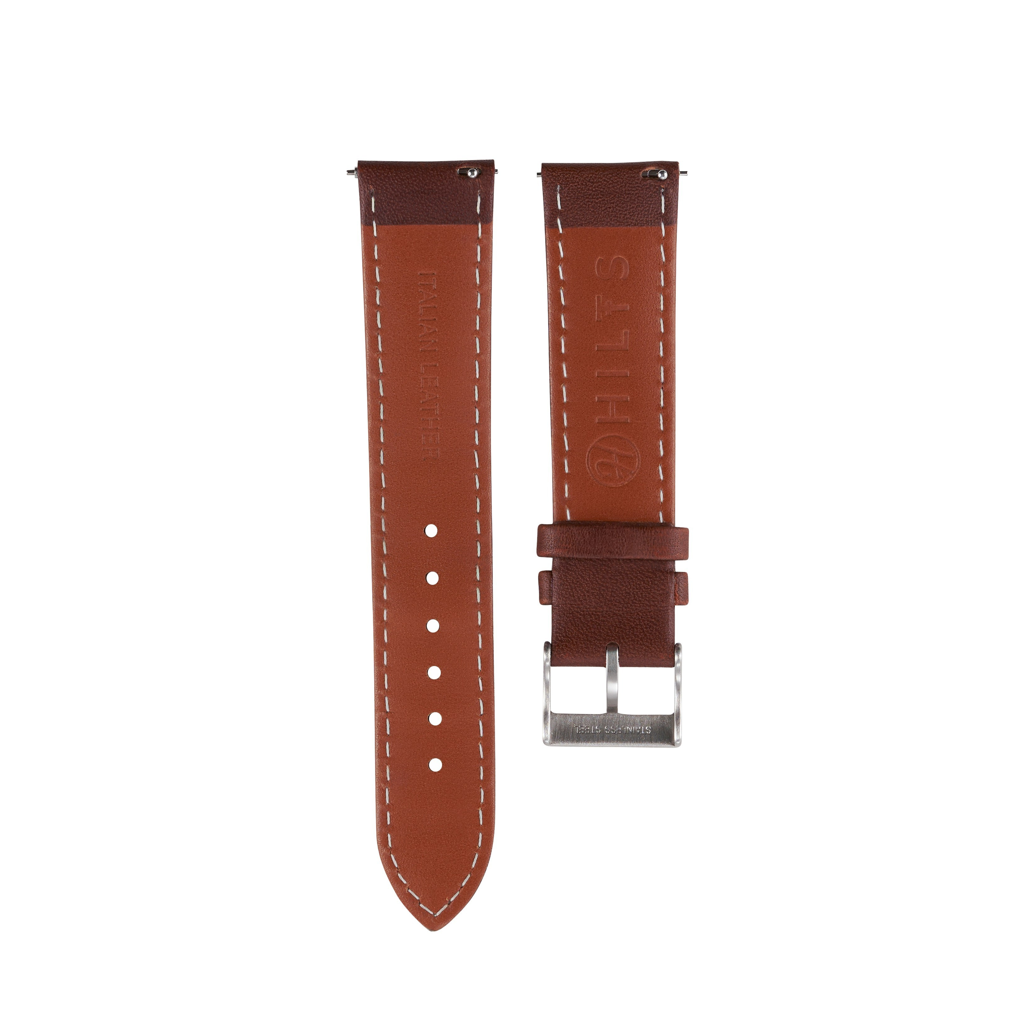
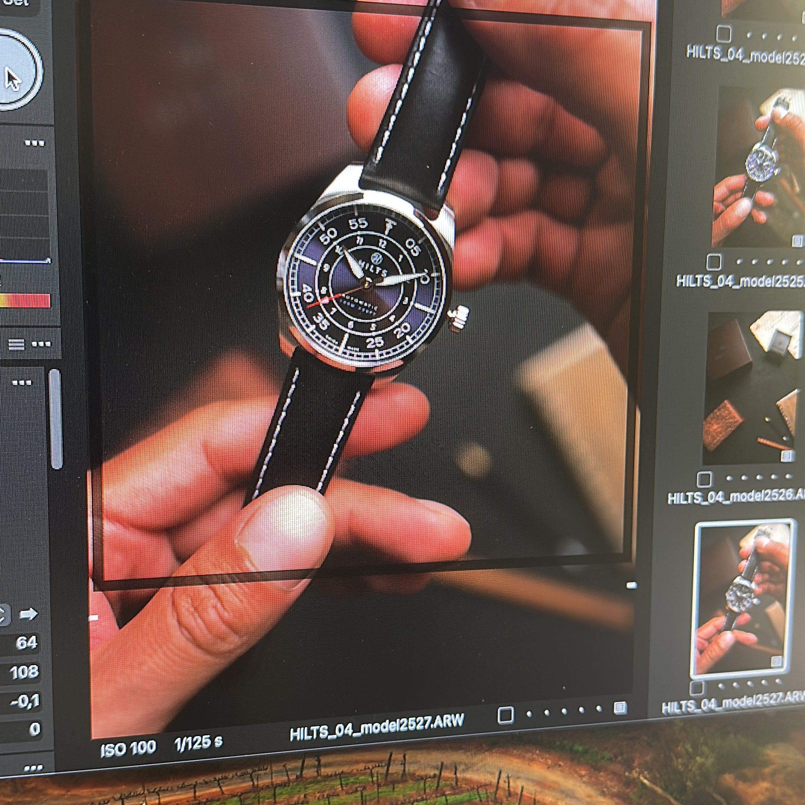
In practice: one frame is worked up, that colour is agreed, and the rest of the series is matched to it. If there are tone variants very close to each other, approval happens with the variants together in one image, not separately: side by side they’re distinguishable; one at a time they aren’t.
On how this fits with the rest of the finish, we wrote what to agree about retouching before the shoot.
6 · After delivery, colour keeps travelling
The approved image isn’t always the one the end customer sees, and it’s worth knowing where it changes.
Marketplaces recompress images and can shift the tone slightly. Social platforms apply their own processing. Print works with a different colour mix than a screen, and some highly saturated tones simply don’t exist on paper. A colour approved for the listing may need a different version for the printed catalogue.
If you know in advance where each image will live, it gets prepared for that destination from the start.
Before the shoot
- A physical sample of the product or fabric, if one exists.
- Your brand colour code, in whatever system you use.
- A previously approved image, if you want to match something already published.
- A list of tone variants that need to be distinguishable from each other.
- Who approves colour, and on which screen they’ll look at it.
- Where the images will be published: listing, social, print.

Got a difficult colour? Tell us when you ask for a quote: with the sample in front of us it’s quick to say what’s a question of light and what’s a question of material.
Product photography · E-commerce photography · What to agree about retouching
How to prepare and send your product to the studio

Shooting a product that hasn’t launched yet

Seven things to agree about retouching before the shoot

Ten questions before hiring a product photography studio

Where AI works in product photography and where it doesn’t
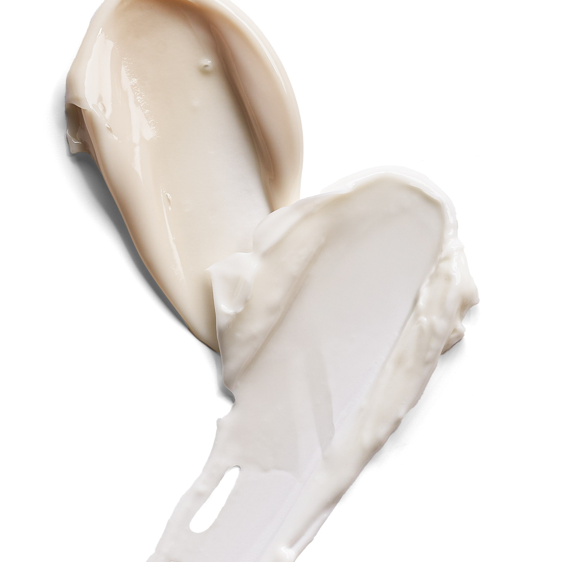
The shot almost nobody gets right: textures and swatches
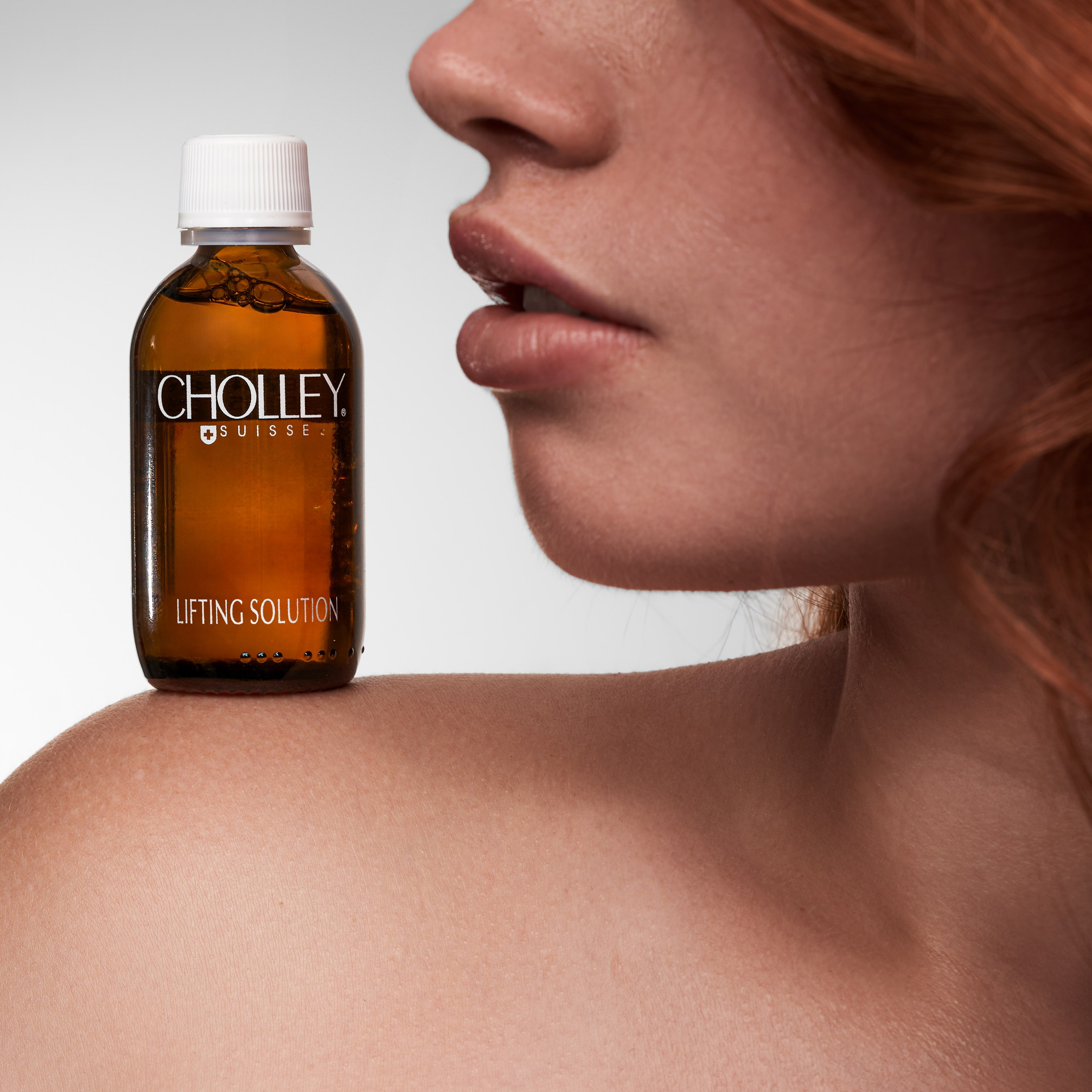
Catalog and Campaign
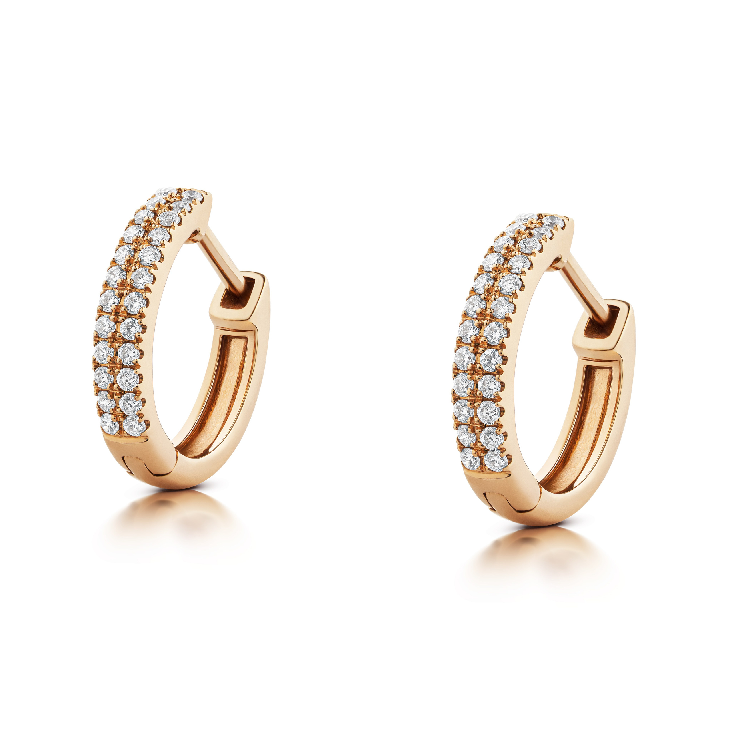
Why your gold comes out looking like yellow plastic
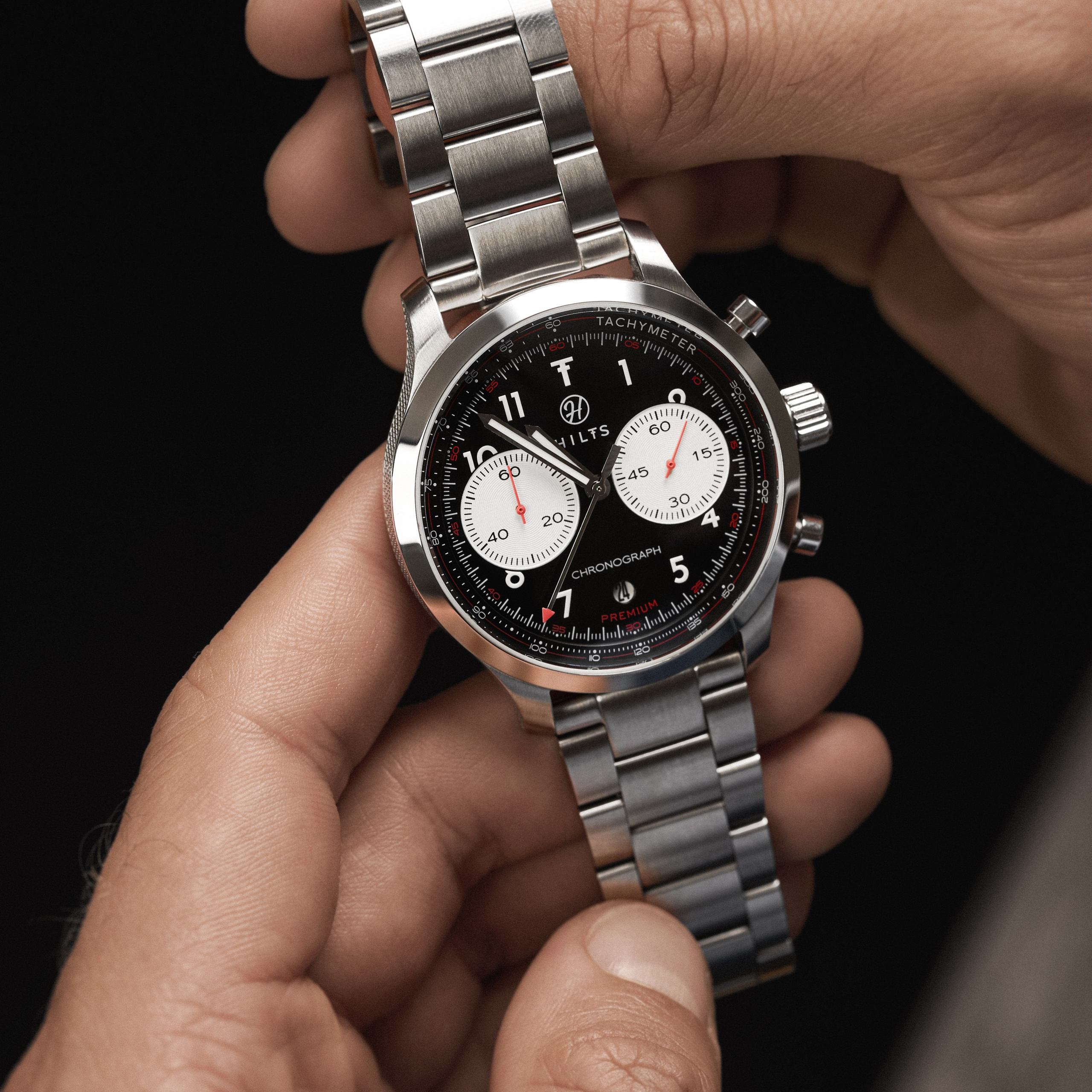
A dial under glass: the problem nobody sees until they do
Why Amazon and Zalando Reject Your Product Photos
Why Do Watches Show 10:10 in Photos? Myths and the Real Reason
Still life photography in Barcelona

Product Photography for the Web in Barcelona: A Complete Guide to Improving Your Online Presence